jamie’s journal
This year i will be exploring screen-printing in depth, hopefully learning the ins and outs of the process to eventually combine relief and screen together to produce mixed media multi-layered prints.
I’ve recently been inspired by the work of Jason Logan and I’m currently reading and evaluating his book, ‘Make ink’. I’ve started making my own natural inks and alongside learning about screen, I plan to create my own natural printmaking inks to be more sustainable within my practice and create some very special editions!
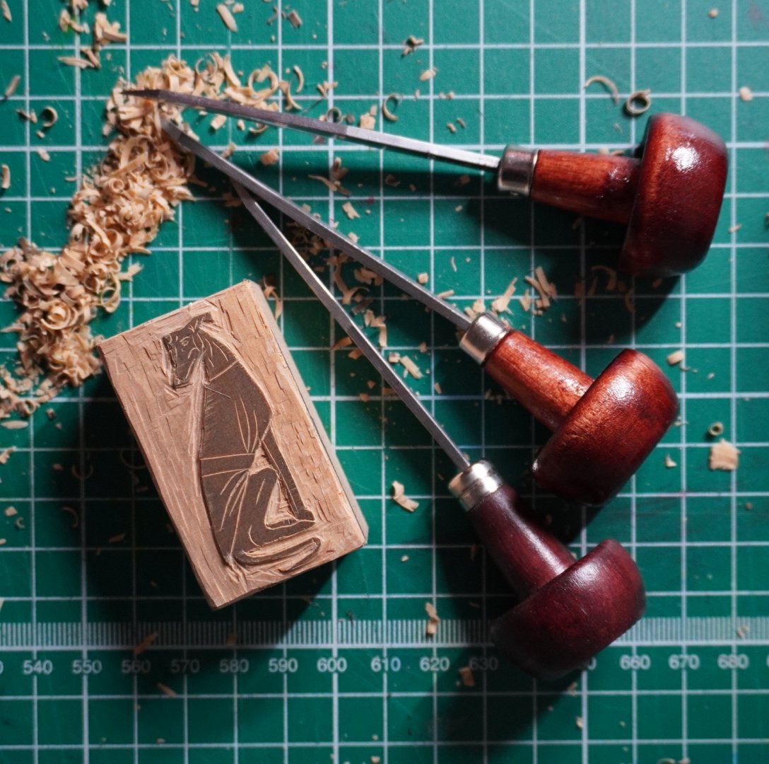
As someone who explored the digital mimicry of traditional printmaking processes, I still use digital softwares like procreate, illustrator and photoshop today. I keep a personal sketchbook and draw things I find interesting, some of these sketches are further developed into these digital programmes, here I can make quick and easy changes to compositions and ideas, allowing me more freedom in creating my print designs. From there when it comes to relief, I’ll transfer an image to linoleum using an inkjet printing process I developed myself. I stain my lino blocks so I can easily see what I’m cutting and when cut, I roll out my ink, ink my block and print using my lever action press!
I like the idea of using screen print to further develop practice. By scanning in my own lino prints, this should allow me to infinitely play with size and colour within margin of the process. Not only this but it’ll help keep my visual language cohesive. Colour within relief can be restricted for me because of the price of oil-based inks, screen inks are significantly lower in cost and are easier to accurately mix in comparison.
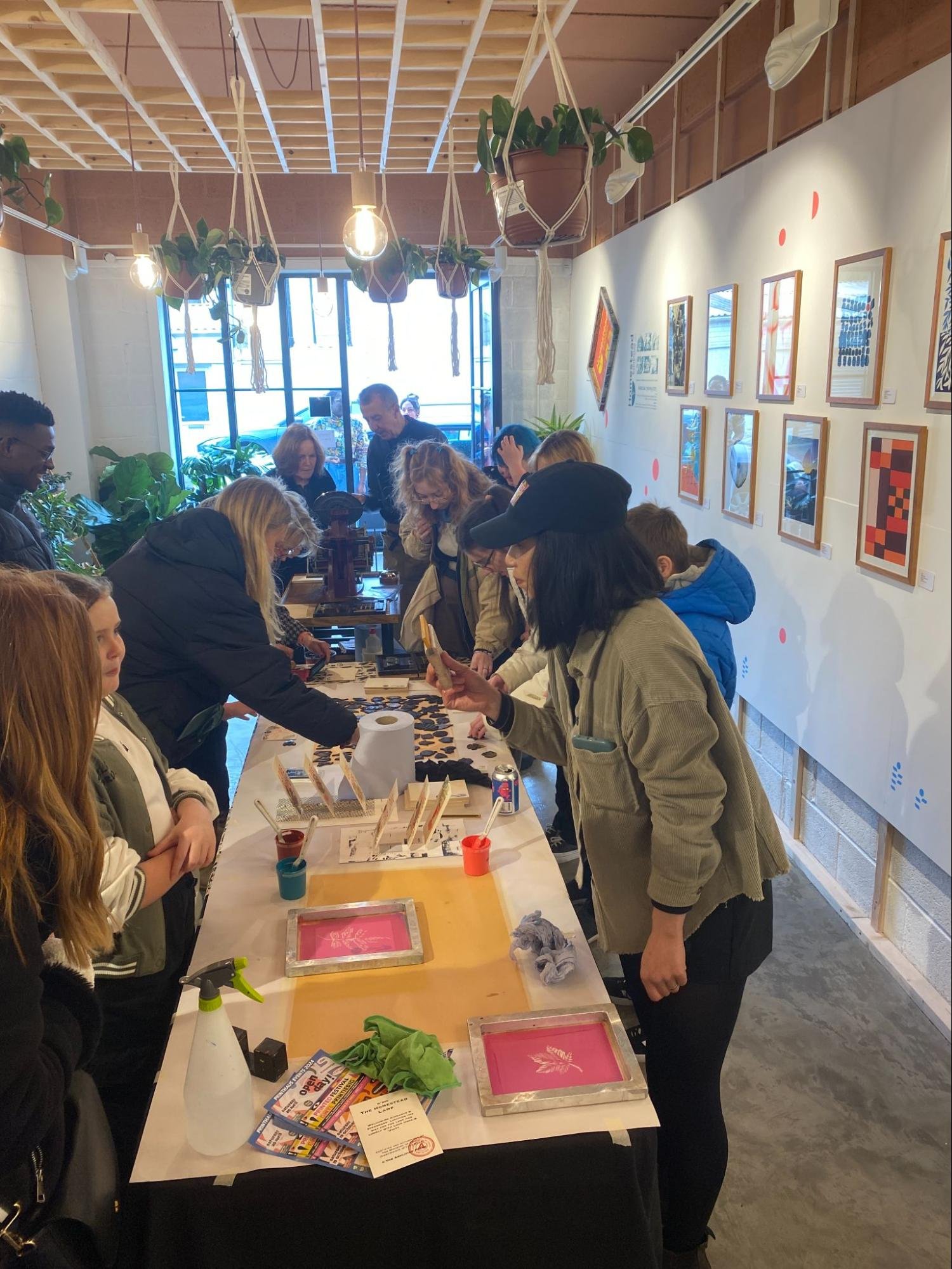
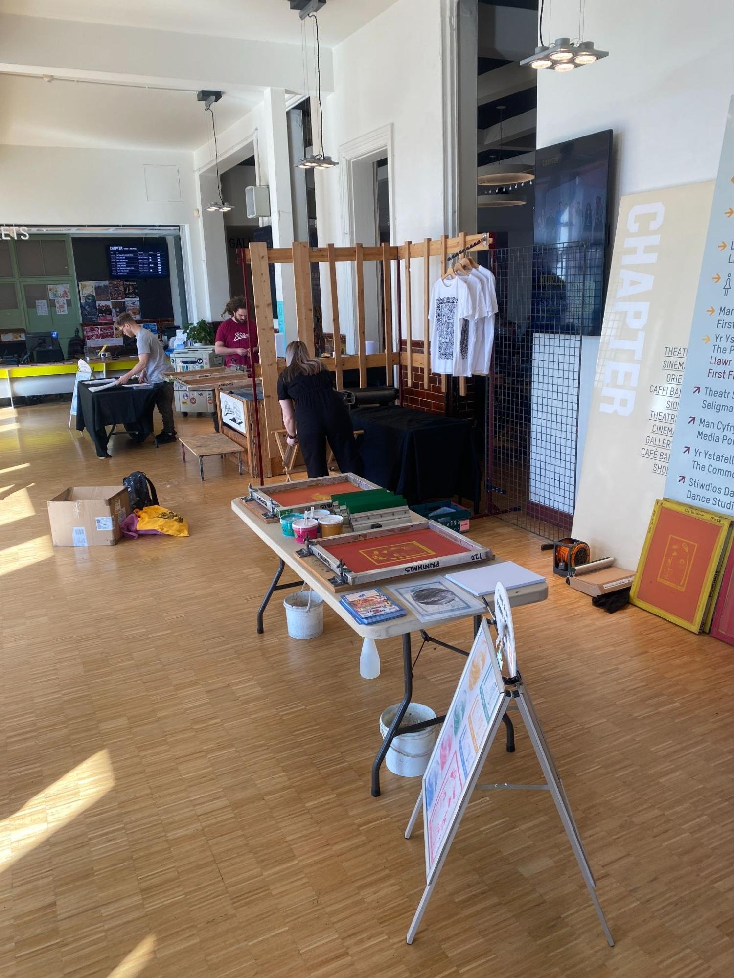
Introduction to Screen on Paper – 04/10/23
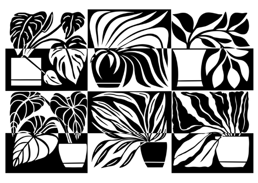
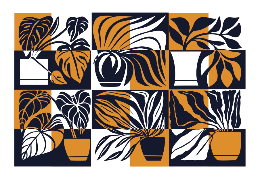
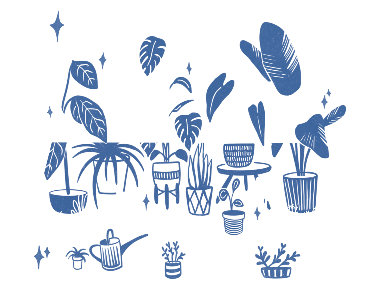
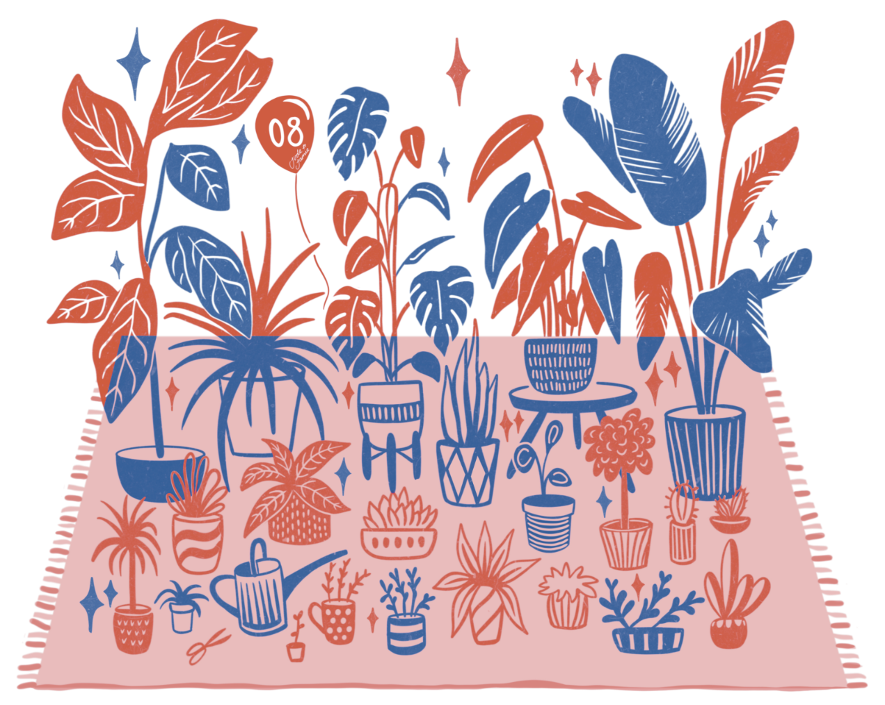
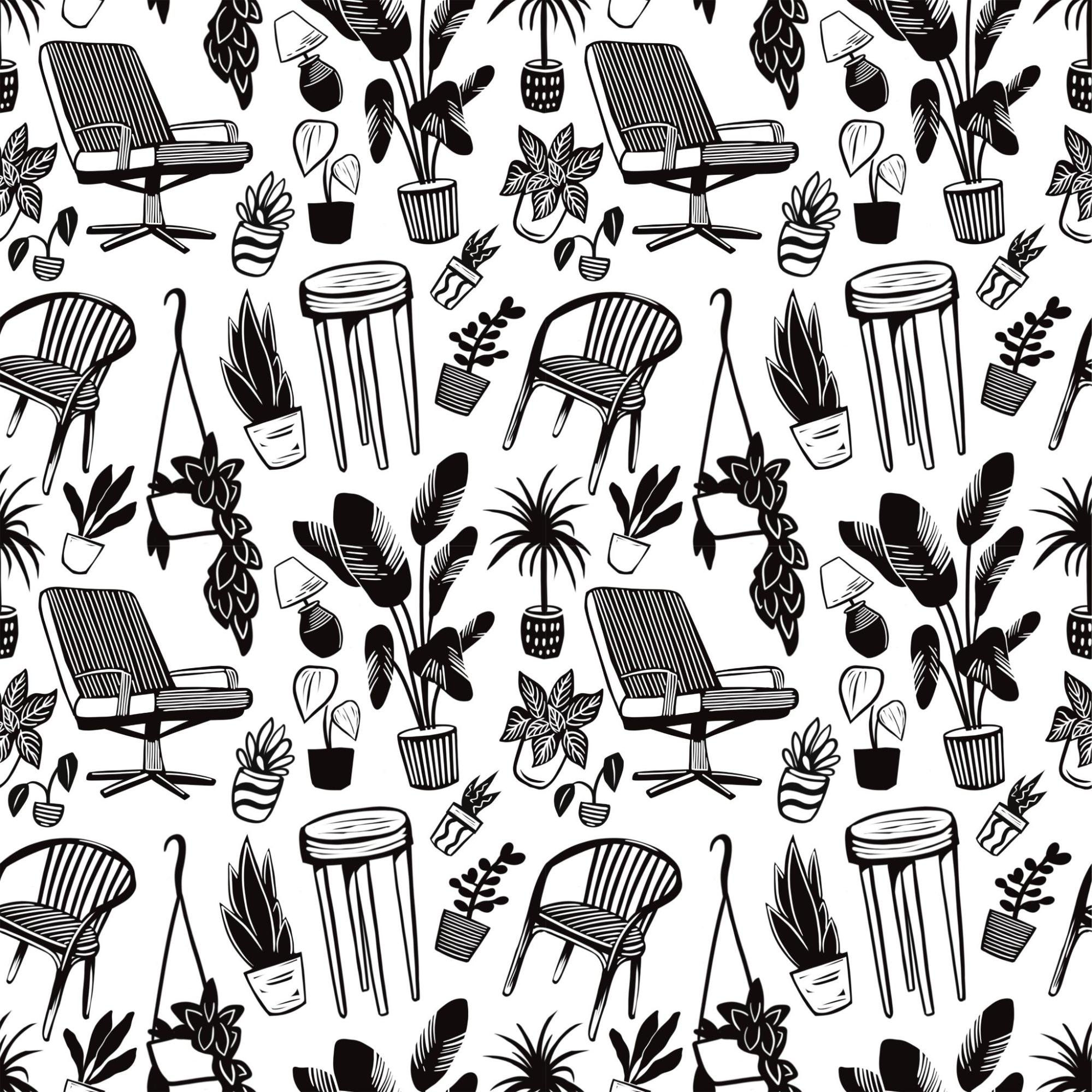
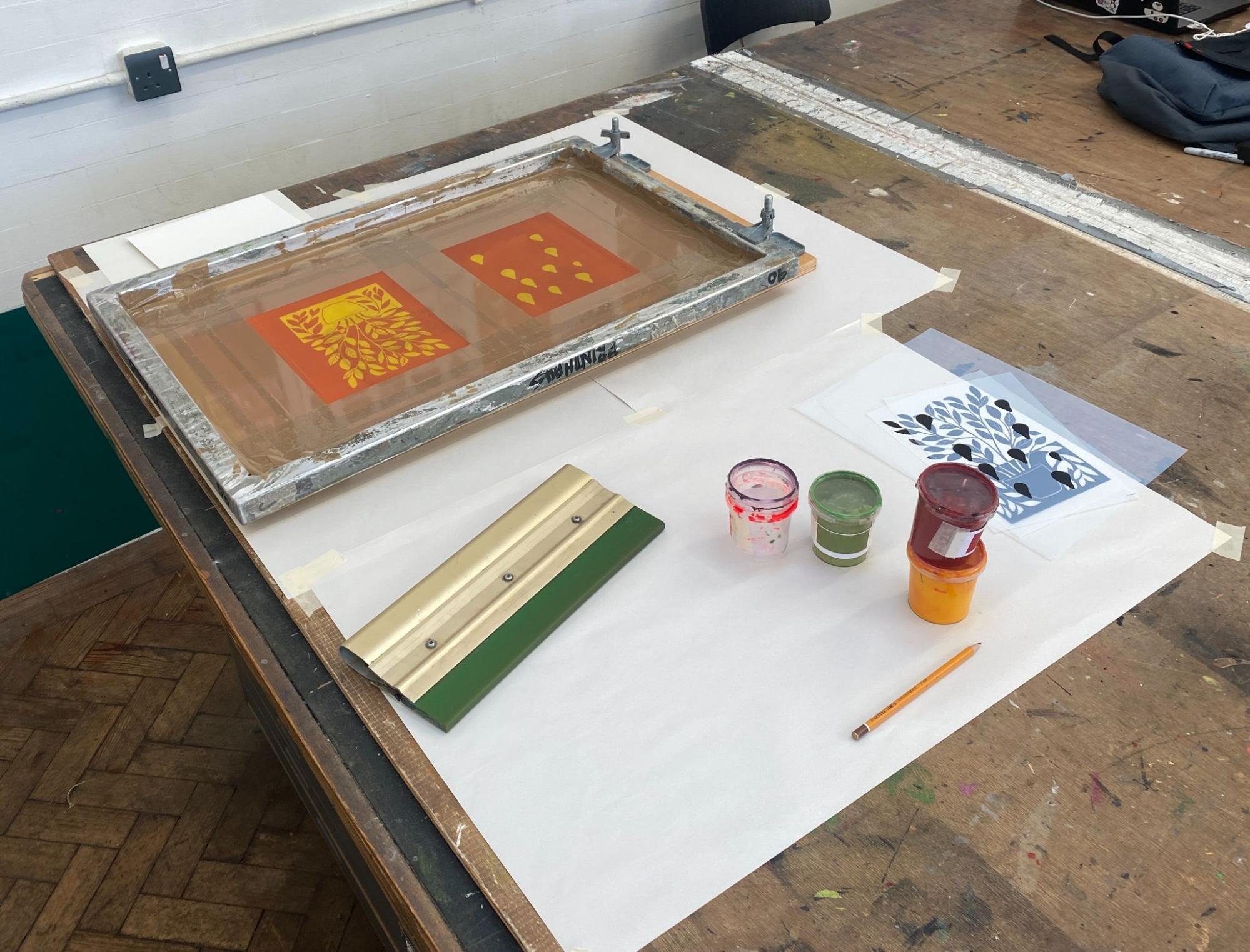
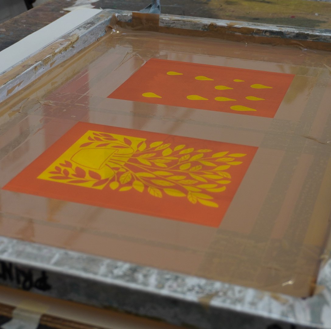
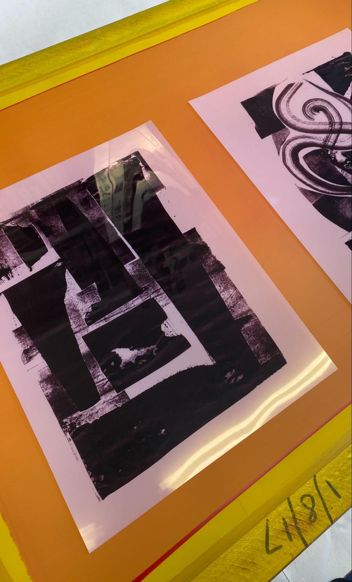
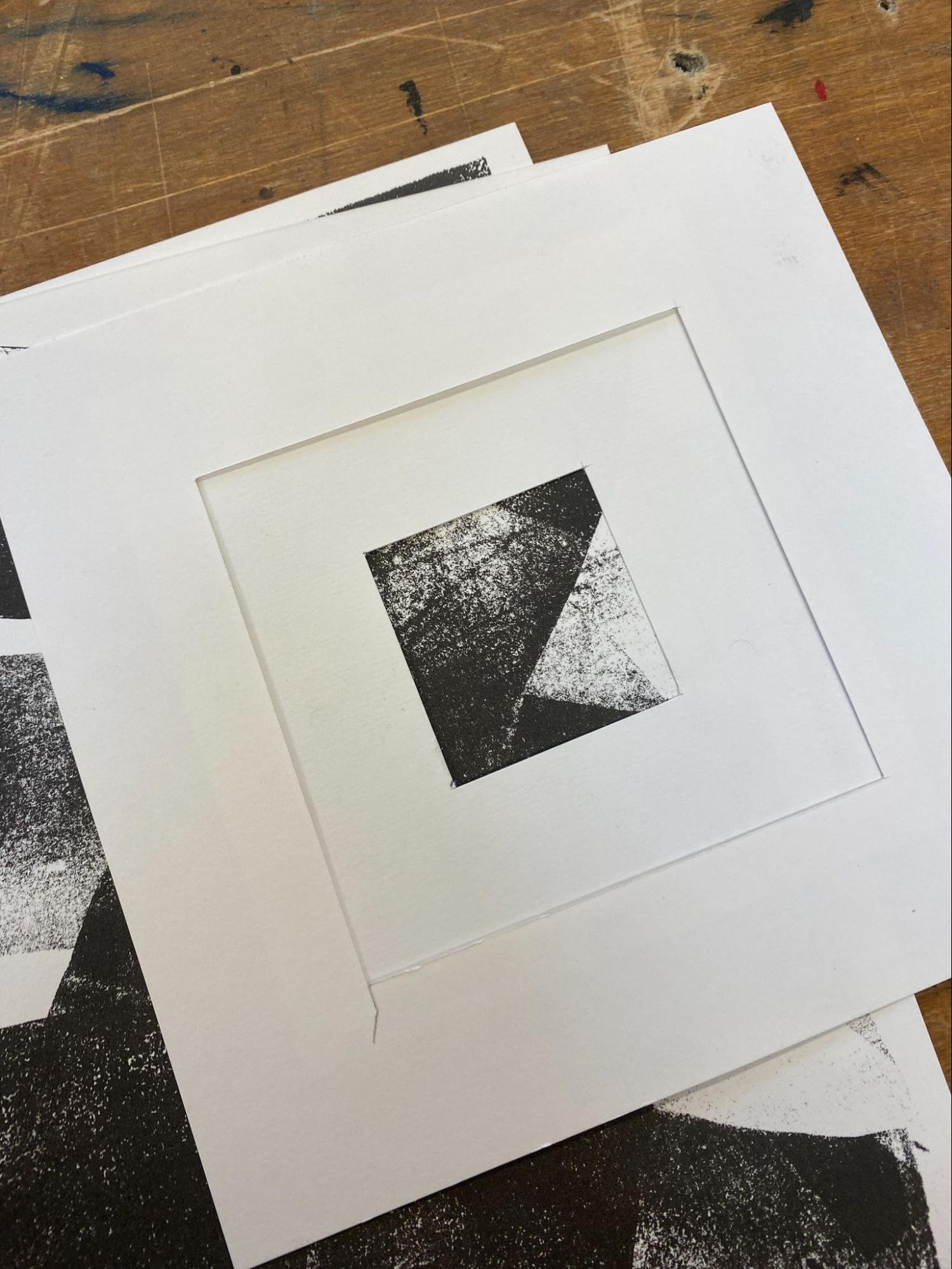
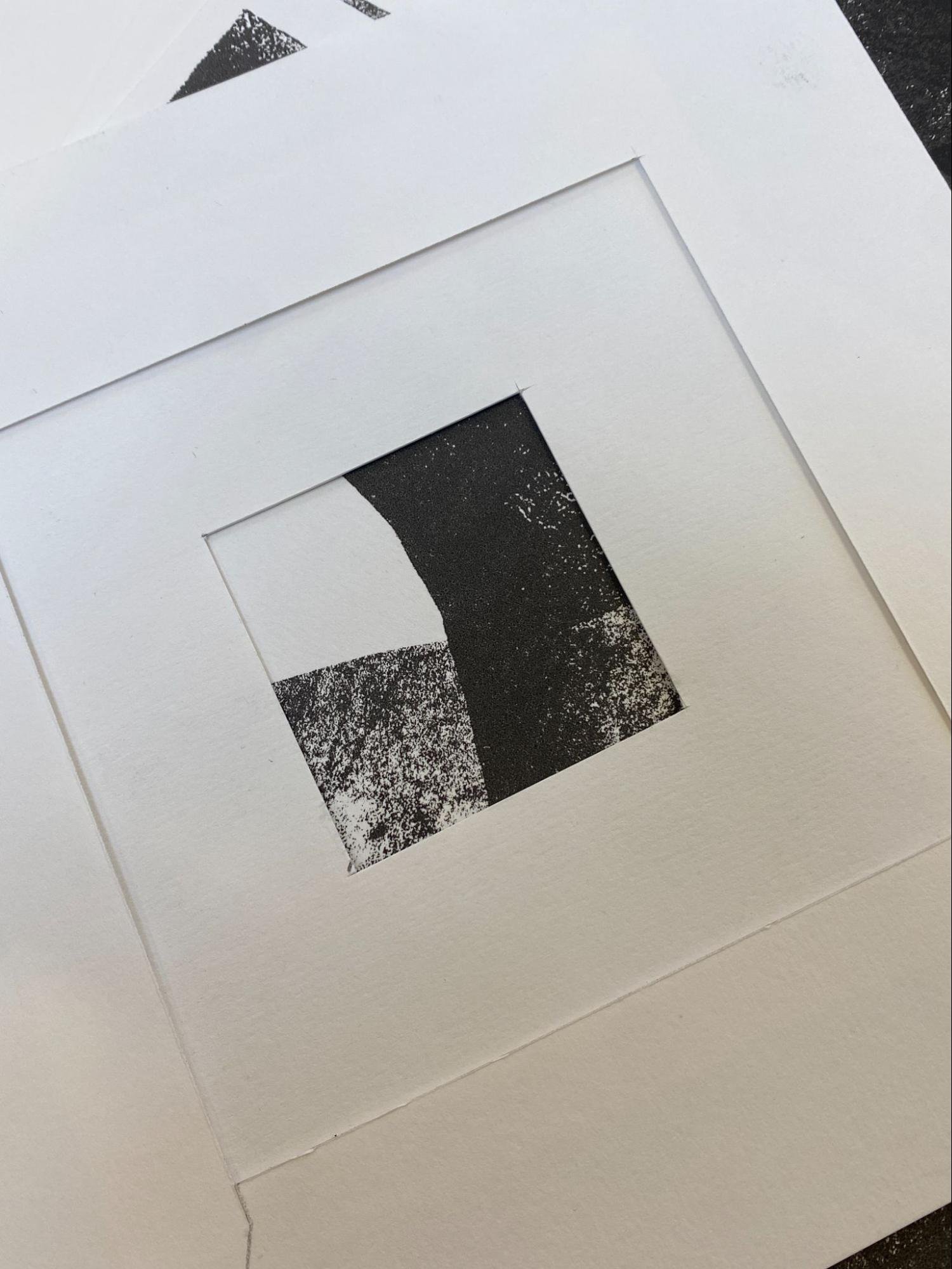
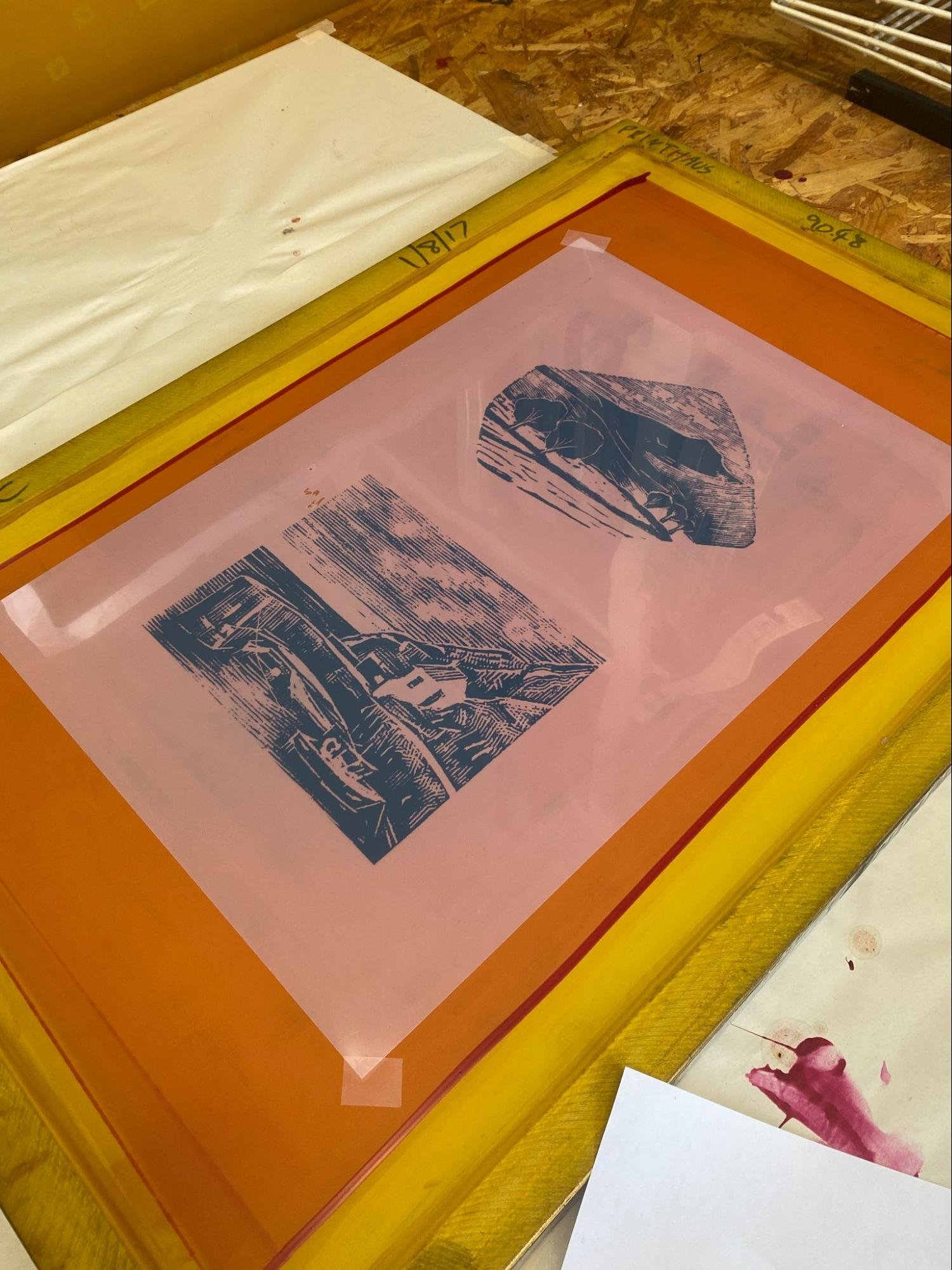
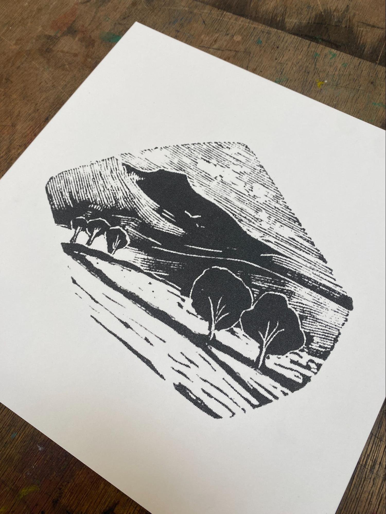
My first introduction at The Printhaus, today me and Jude looked at the basics of screen printing, more specifically printing in one color. Jude ran me through all the equipment in the studio and what I needed to know to get started! I brought a design along with me, derived from my linocuts I had recently been working on, it is a play on negative space revolving around house plants.

I started off with screen prep, coating my screens with light sensitive emulsion, a thin layer needed to be applied to the screen and we did this by using a trough, after this they needed to be baked to dry out the emulsion.
Whilst the emulsion was drying on my screens we worked on my design, I printed out an image that I’d bought from home, took it to the scanner upstairs and scanned it into photoshop. Here we were able to check for any anomalies in the image and size it ready to be printed onto an inkjet film. By the time we had done this the screens were dry and ready to be exposed.
We took the film to the exposer, grabbed the screens, and taped the image face down to the mesh, making sure it wasn’t close to the screen frame, as this would cause issues with pressure when printing later. After this we put the screen in the exposer, closed the lid, set the vacuum for 1 minute and the light timer to 30 seconds. Once exposed we took them over to the pressure washer, rinsed them and blasted out all the emulsion that hadn’t hardened within the screen. The stencil was ready!
The emulsion that we applied to the screens hardens when exposed to light, our image being black, stops/blocks the U.V light from setting the emulsion in that area hence why we are able to wash it out.
From here we waited for the screens to air dry, this time Jude showed me a new way of registering a print. I use a similar technique within my relief prints, so this was super helpful. To do this I cut out a piece of paper the exact size of my stock, marked out the centre point and taped my inkjet image right in the middle. Ensuring that the space around the image was equal, this would be my natural frame.
To make this even more accurate, what I could do is add two registration marks/crosses, one above and one below the image. Then i’d be able to line the crosses exposed on the screen to the crosses on my registration sheet.
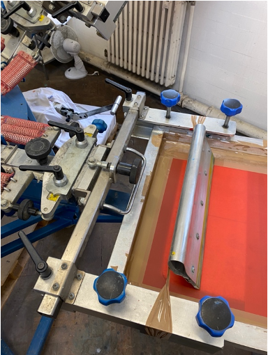
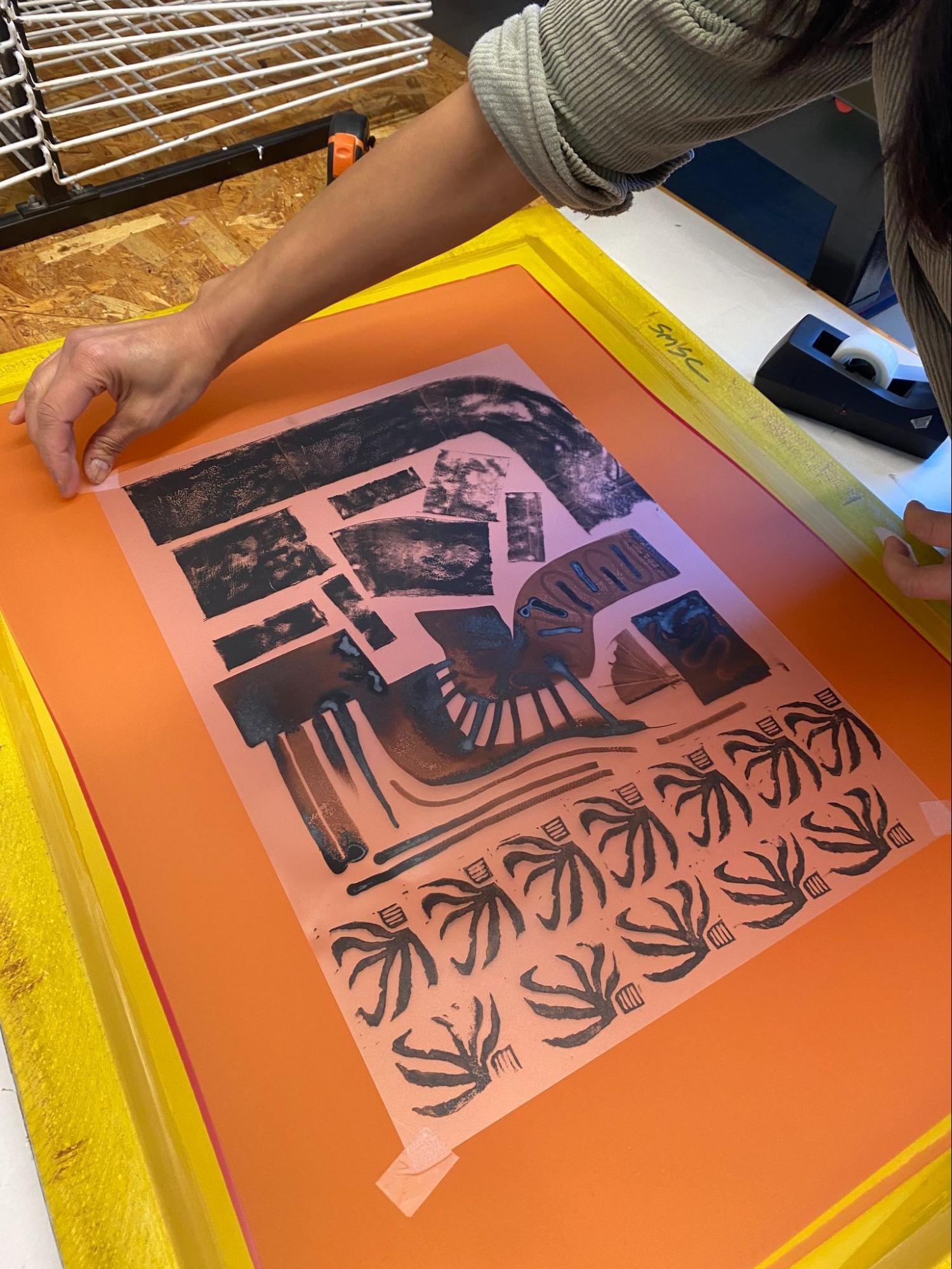
It was time to print! Once the screens were tightened into the flatbed frame, we placed newsprint around the area of print on the flatbed surface. Screen-print flatbeds have vacuums with them and by doing this we can create more suction in one area. This will prevent movement and the paper from sticking to the inky screen. Not only this, but any ink spillage would fall onto the newsprint, making it easier to clean later.
I taped up the edges of the screen using parcel tape, which would stop any ink from seeping through the mesh. Registered the screen to the registration sheet I had made earlier and set paper tabs onto the flat bed.
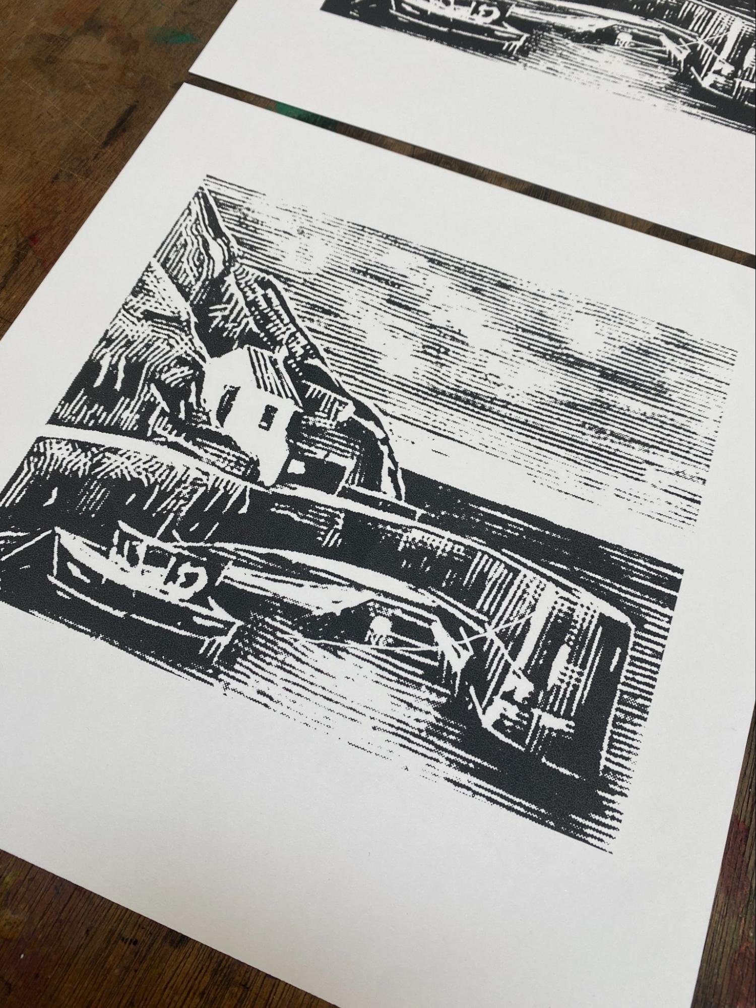
Once the press was setup we started printing, in terms of colour I chose a pre-existing sage green that complemented the off-white hue of the G.F Smith paper. Poured a good amount just above the image and ran a few test prints through the screen. Once I was happy, I switched over to the G.F Smith paper.
This was the result…

I liked it a lot and as a result of this I decided to print a short edition of 20!
Open Day Design - 05/10/23
As part of the Printhaus Open Day I submitted a design to be used by members of the public to print their own tote bags.
This way my design and what it looked like printed onto a bag..
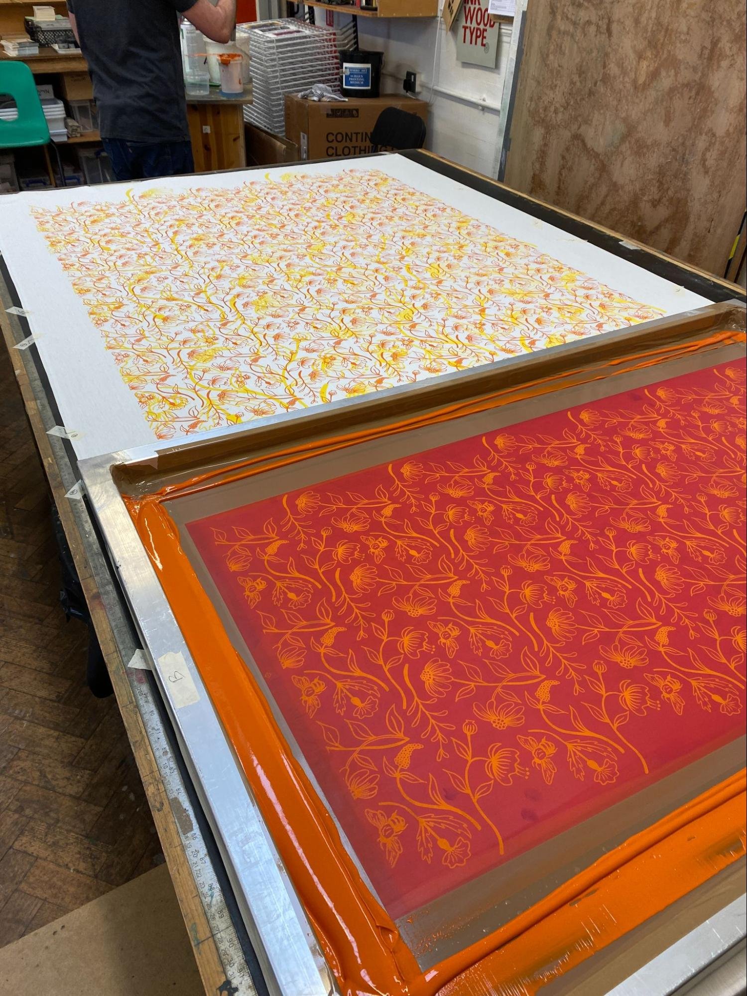
Introduction to T shirt screen printing with Tom – 11/10/23
Today Tom introduced me to screen printing T- shirts, a process that I thought would be like screen printing on paper but in fact it’s completely different.
We started off looking at my design and my vision for the T-shirt, we then took the design to Photoshop and got it ready for print. One of the things we needed to do was overlay the orange layer with an inverted version of the black layer. This is because we don’t want the two colours to overlay on the t-shirt, so effectively we are using one image cut into two.
These were the layers and the design in full that I brought with me:
Before exposing I needed to place my image a specific distance from the top of the screen, this would help later when aligning the image to the T- shirt.
Screen preparation was the same as before but this time we needed to use a lower number screen. The screen we chose was a 45, when printing onto fabric we want the screens to let more ink through, this will ensure better ink coverage and prevent blotches/misprints.
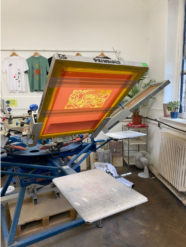
When the screens were ready, we taped them up, and then Tom walked me through the carousel upstairs. We looked at how to attach the screens, how to adjust snap and micro registrations. I was shown a clever way to make a squeegee holder using brown tape too.
I then grabbed 3 T-shirts, two testers and a final. Placed the screens in the carousel and turned on the big dryer as well as the lamp attached to the carousel. I decided that I wanted to complement the orange with a navy, so we found pre-existing colours suiting the description and started printing.
I found out that ink consistencies affect the amount of pressure that you need to apply whilst squeegeeing. The thinner the ink the less pressure and the thicker the more.
We sprayed the platen with a tiny bit of glue and placed the shirt onto it upside down with the front facing up.
We screened the first layer, spun the carousel so the image was under the heat lamp to dry, then aligned the second layer to the first through the screen. When aligned we printed the second layer completing the image and then put the t-shirt through the big dryer to fully cure.
Although I loved the process I feel like there’s so much more to learn and I need to return to it to gain more experience.
This was the result, super pleased with how they turned out!

Open day - 21/10/23
Today was the open day! With some workshop experience in relief printing I was chucked straight into the deep end, by running the print your own poster activity alongside another Printhaus member. This was really helpful for me to gain a bit more confidence with screen printing and by the afternoon i’d learnt a lot about the physical side of the process too.

Printhaus Calendar 2024 - 28/10/23
Super happy to be involved in the design of the 2024 Printhaus calendar, I took on the month August and made this risograph design. These are the separate layers and the final image.
Excited to see the final outcome!

Mark making 25/11/23
Today we looked into mark making and how we could directly make marks onto screen printing film. A way of introducing hand drawing/mark making into screen print.
I used multiple different techniques and materials, from etching inks to your standard fine liner and I even made a quick rubber stamp to experiment. We drew straight onto 3 different films, filling each of the sheets. We then covered them with talcum powder to reduce any unwanted ink transfer later on, as the etching inks were oil based and would never dry in time.
We prepped multiple screens and exposed the film onto the screen as we have before. However this time, Jude showed me the perks of the U.V emulsion that Printhaus. We exposed the screens for as little as 8 seconds which was surprisingly enough to let the emulsion set.

Whilst washing the screens Jude also showed me a way of being more delicate with the process, by using a scouring pad and the shower head instead of the pressure washer sometimes it will allow you more control and reduce the chance of you blowing out any minute marks.
When the screens were ready I got to printing, I printed several black and several In a vibrant orange. I really liked the definition in the mark making, especially with the ribboning on the etching ink marks.
When dried I took them back to the upstairs studio as I had a plan to overlay some of my Lino blocks. This also gave me a chance to use the Hawthorn Etching Press, which was different to any previous etching press that I had used. We did this by using linoleum runners which were the same depth as my blocks, this would allow the press to sit on the runner, which would apply more even pressure and allow the press to glide over the block whilst printing This also opened the door to paper embossing which could be interesting when combined with screen print.
Whilst in university I had already experimented with overlaying linocut over screen, but only with a block colour and not pattern. The result was interesting, but I think I preferred the prints without the combination of Lino.
The nice thing about this is you bypass the digital aspect of screen printing, it can give you a more analog approach to creating prints and from an abstract point of view I find it very interesting. May play with this more!
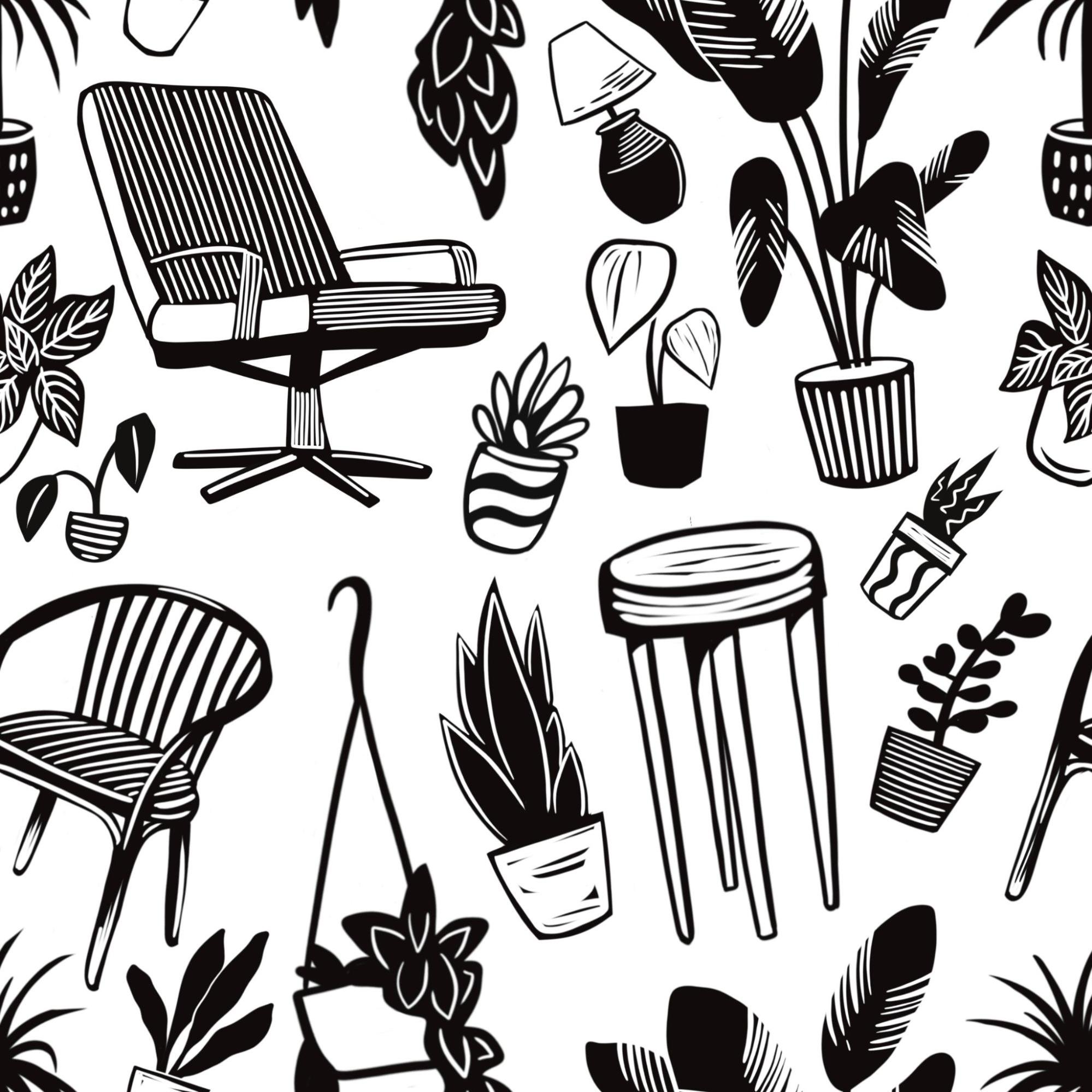
Random Pattern Fabric Printing 08/11/23
Before the session I was asked to create a series of illustrations to be used in the textile session.
I continued with the theme of houseplants as well as adding a few mid century furniture items. They were created in the style of linocut to keep the work cohesive.
I combined them all into one photoshop document and used the inkjet printer to print them out onto inkjet film. I then cut each of the illustrations out and taped them up onto 3 screens. With the intent of printing onto t-shirts I had to make sure I exposed each of the illustrations in the right spot on the screen. When exposed I wash out any excess emulsion, let them dry and brought them up the carousel.
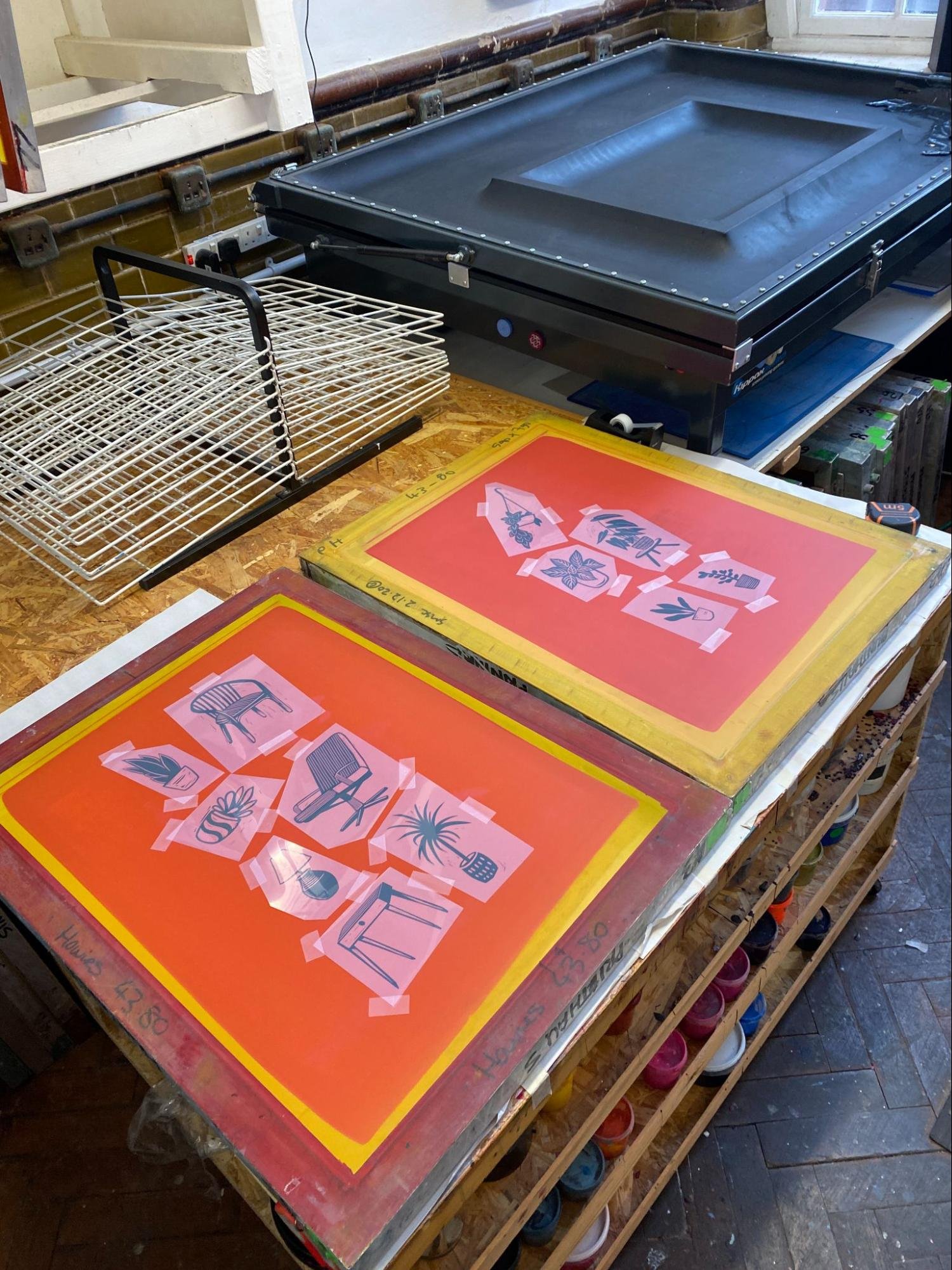
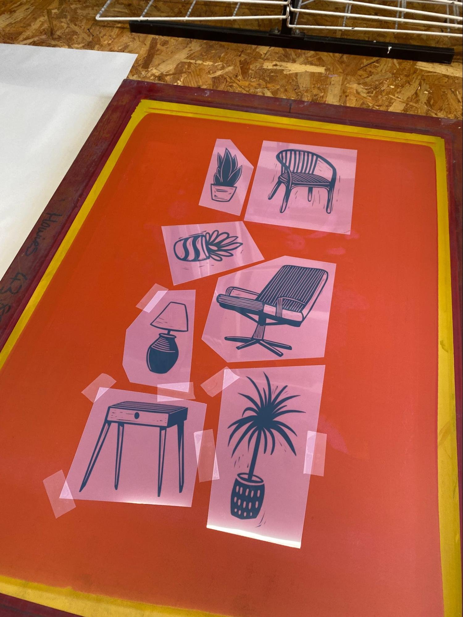
Tom talked me through the different ink mediums and the rough combined amounts to make my own and we settled for an autumnal colour palette. He also showed me different tricks to holding squeegees and we started printing.
In the session I learnt a lot about ink consistencies in fabric/textile printing. The thinner the ink the less pressure you need to apply. Too thin and the ink will bleed straight through the mesh or on the t-shirt itself. The thicker the ink, the harder you have to press, less ink will travel through the mesh, sometimes resulting in two squeegee passes. All things that I hadn’t experienced whilst using paper.
We did this by printing multiple of the same image In same colour on different angles and parts of the t-shirt. We then repeated this using different designs and colours. One of which was a translucent white, which when overlapped would create a lighter shade of the colour underneath.
With the t-shirts being upside down on the platen, I struggled with t-shirt placement and where the design would print, me and tom discussed this and another option would be to use several more screens at a smaller size and print them without using the carousel. Something I would like to try in future.

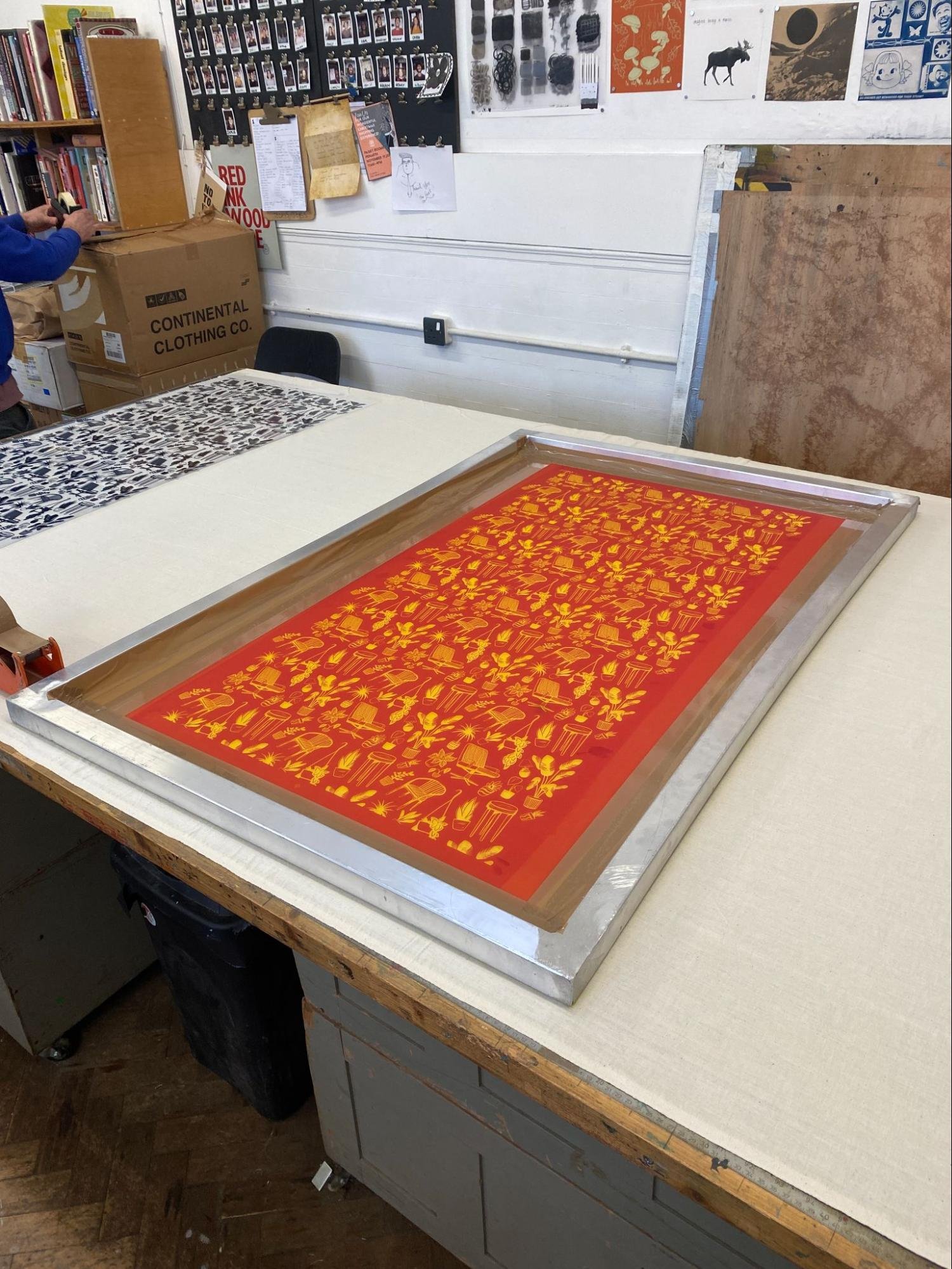
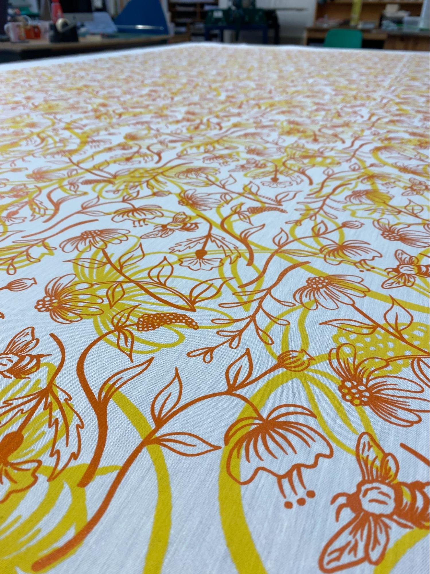
Large Repeat Pattern Fabric Printing 15/11/23
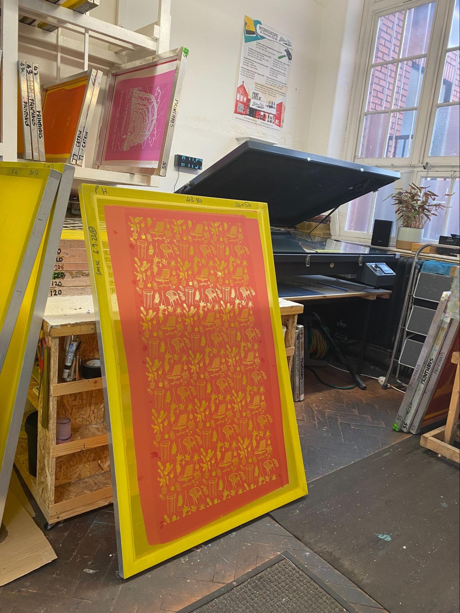
Me and Tom had been planning to hand screen a large piece of fabric with a repeat pattern designed by me. Before turning up to the session I created a repeat pattern swatch which was sent to Tom to be printed, ready for the day. It included the designs I had used for the previous session. Tom removed a few of there images alternating vertically down the side of the design. This would allow us to fit the design together with itself making it seamless when printed.
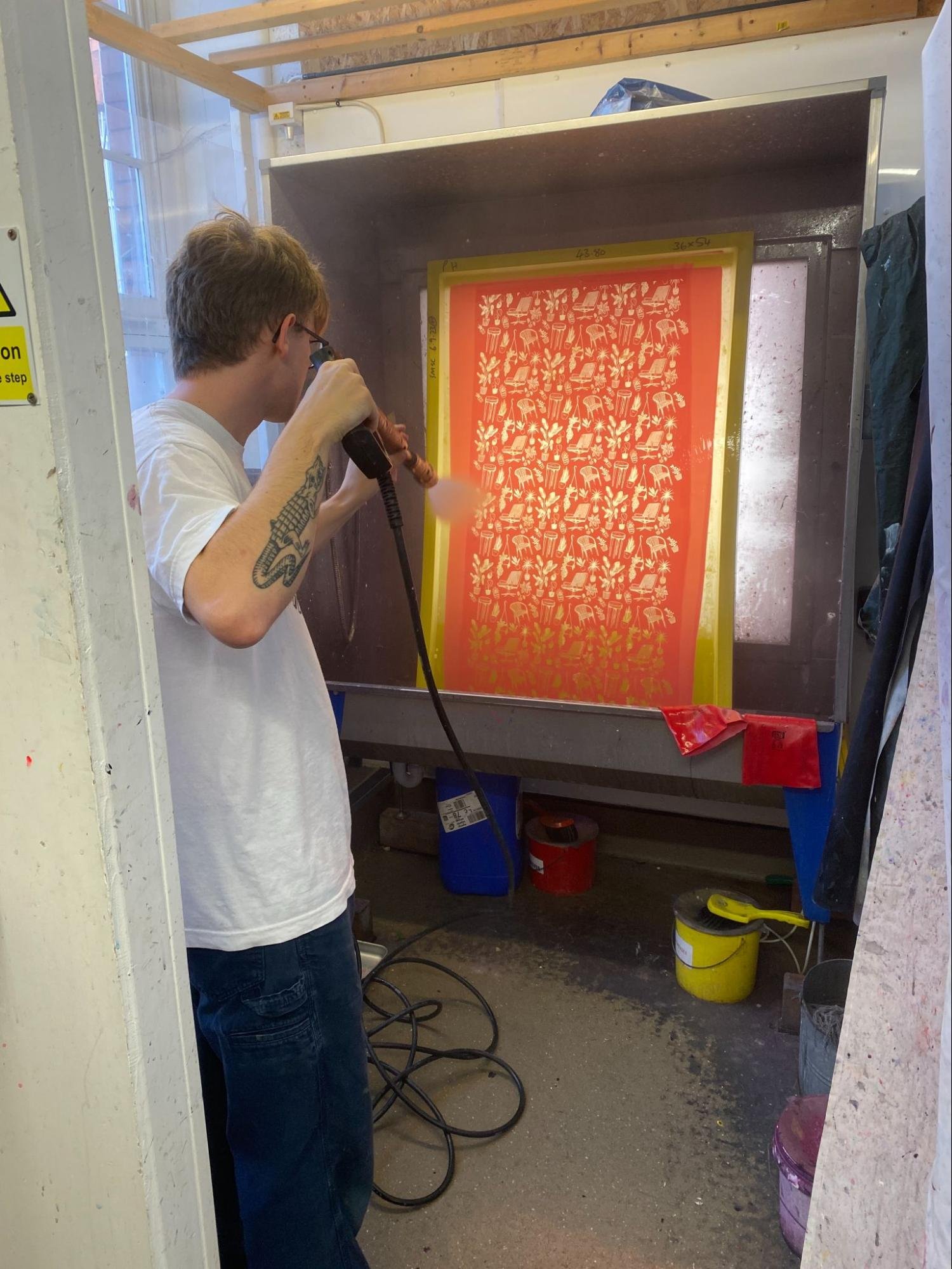
This time we prepped a substantially bigger screen, we talked about handling bigger screens and how to clean them. We exposed the pattern onto the screen, maxing out the size of the exposer bed and washed out any unset emulsion. When dry, we started prepping for print.
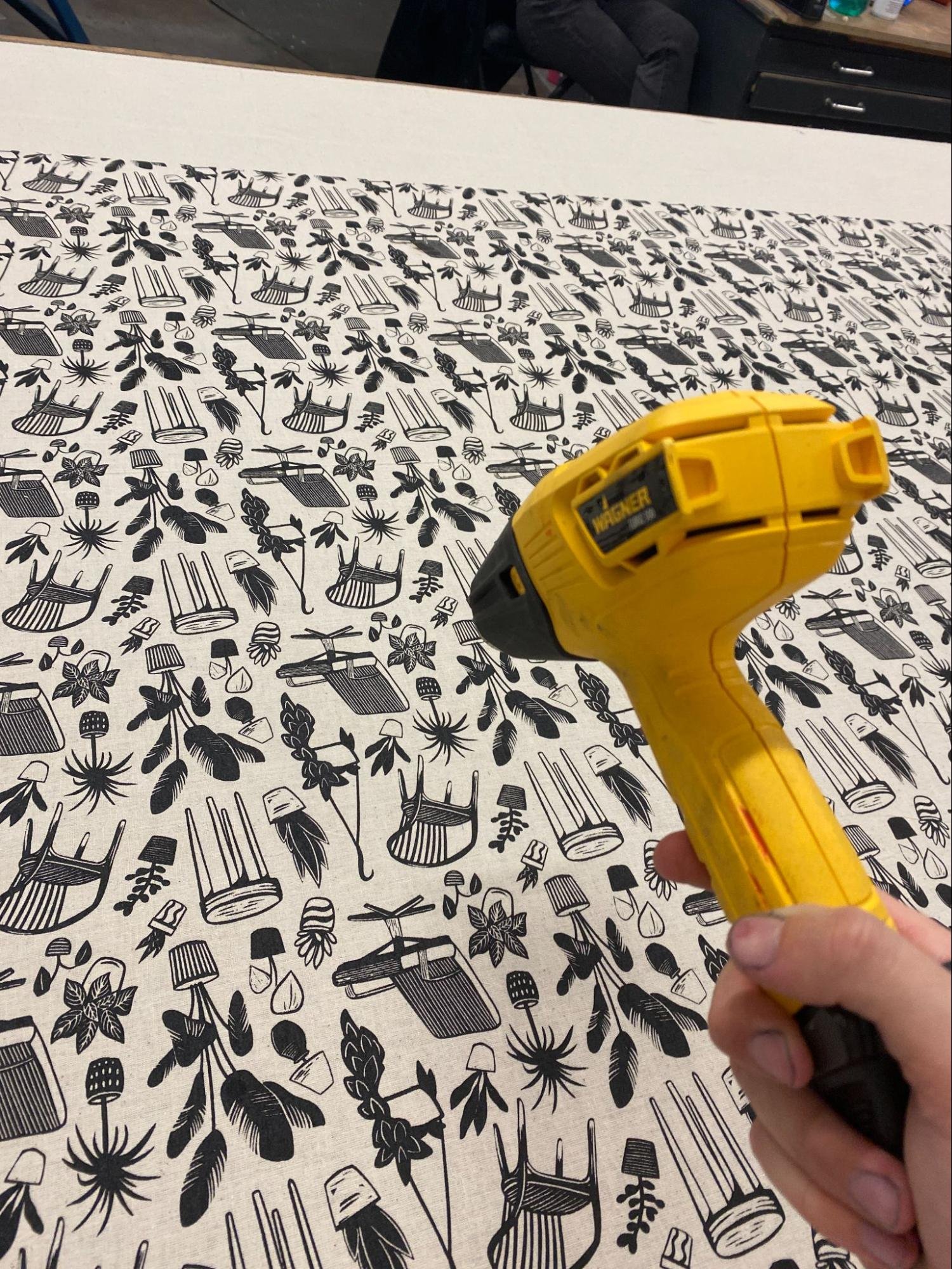
We used calico as our material and placed this on the big table upstairs. Used a spray adhesive to give the table a bit of tack and we ran the fabric through the big heater to smooth out any creases and stretched it over the table. We needed to make sure the fabric was completely flat as this could result in a miss print/prints.
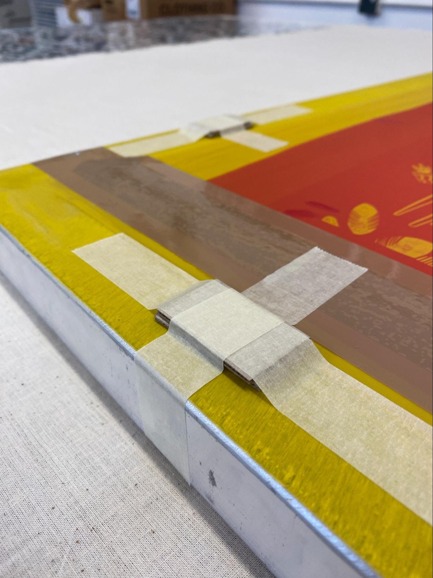
When the fabric was ready we used the screen to mark out our registration lines, we had 4 sections to print. However we weren’t going to print them in order. Instead we were printing them in the order of 1, 3, 2, 4. First 1 and 3 and then 2 and 4 this would allow us time to dry the ink in-between halves. We added tabs of greyboard underneath each of the ends to lift the mesh away from the fabric, this would be our snap.
This was a two person job and we used one squeegee between us. We did this by having one of us push the squeegee, we met each other in the middle, swapped the squeegee over and then the opposite person would pull the squeegee back towards themselves. We then repeated this to flood the screen ready for the next section.
It was a nerve wracking process as we only had one shot! The first few sections I was applying too much pressure or not pulling the squeegee quick enough which resulted in some flooding on the fabric. By fourth section we had it locked down, but by then we had finished!
We dried the ink still on the table by using a heat gun and large fan to circulate air. Once touch dry, we put it through the big heater to cure.
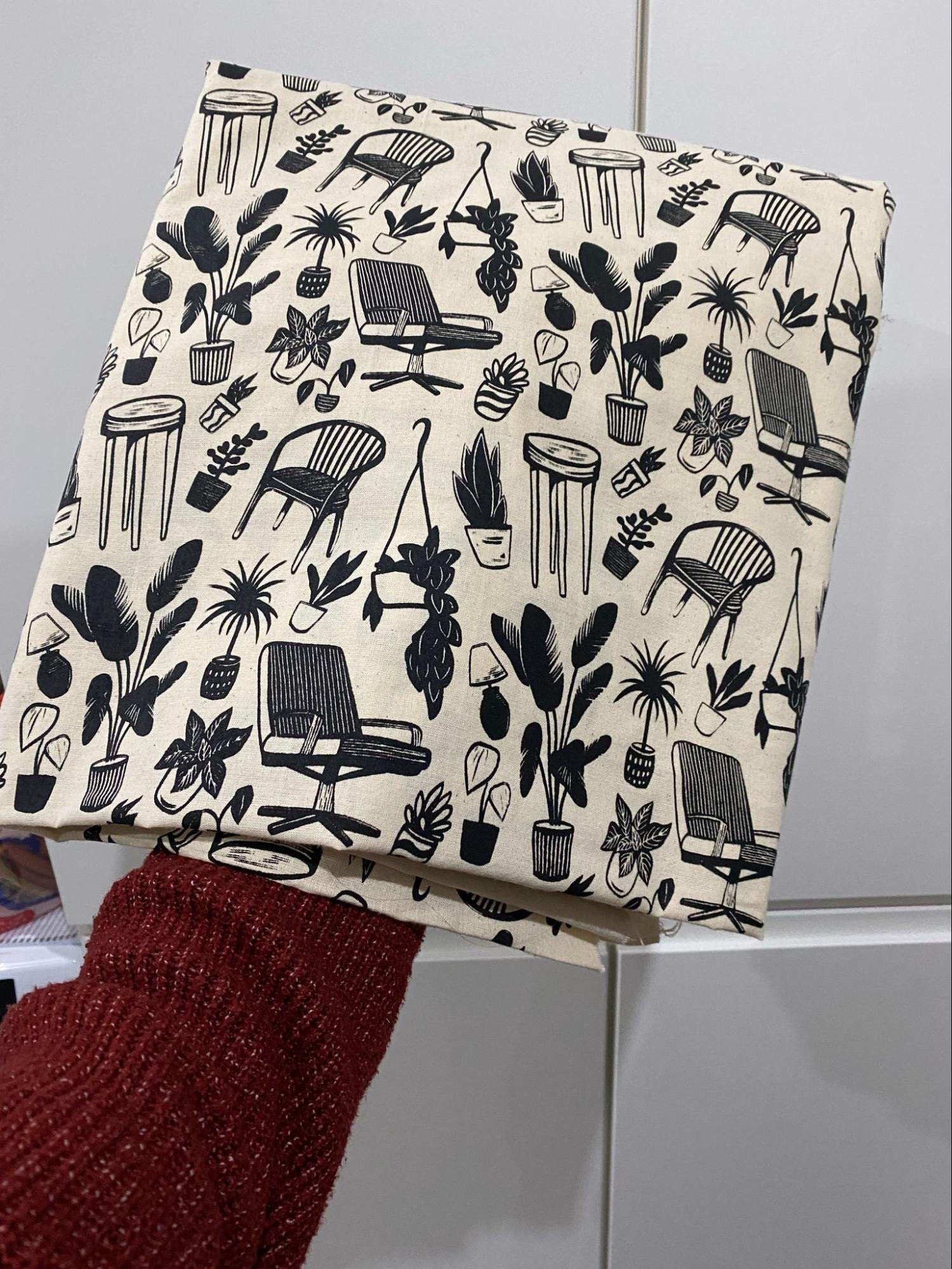
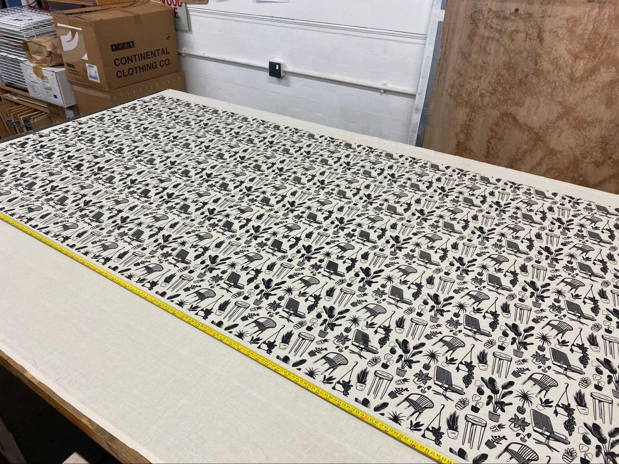
I brought the fabric home, cut it to size and hemmed the edges to turn it into a tablecloth for market tables. The rest of the fabric is going to be turned into pillow cases and tote bags for myself! The whole process was super fun and it is something I’d like to have another go at.
Snapped-Up Market Designs 01/12/23
For ‘Snapped-Up’ market I was asked to create a T-Shirt design as well as a simple Christmas border for both the ‘Have-a-go’ T-shirt printing and yearly Risomatic Stall.
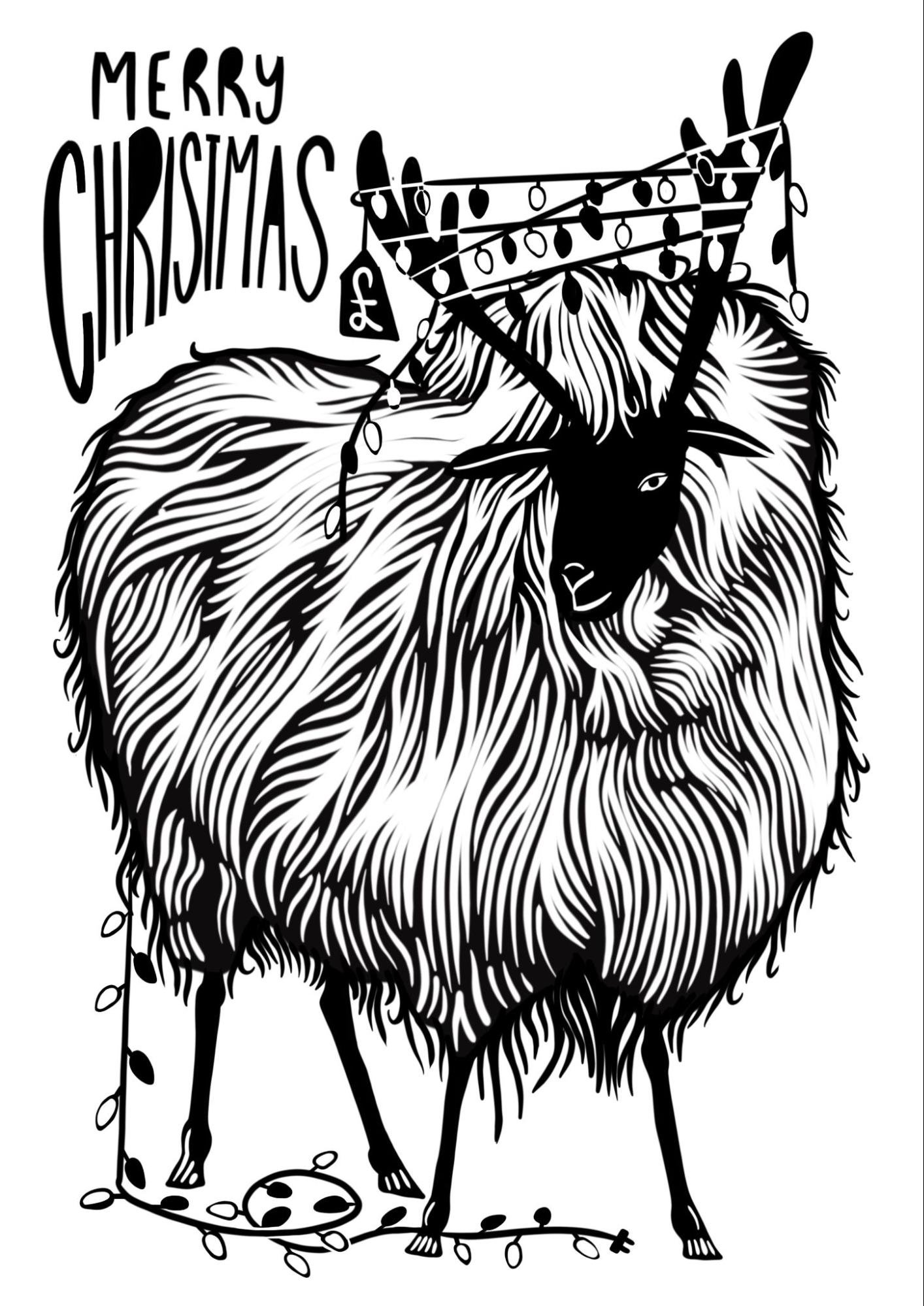
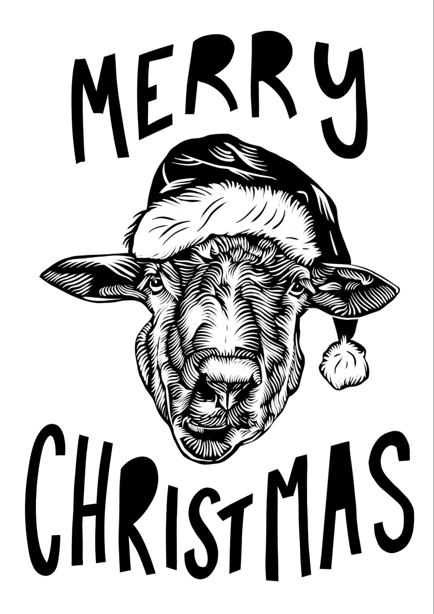
I created two different designs for the ‘have-a-go’ T-shirt printing, however I was torn between the two and ended up using the design on the right. It was really nice to see people printing my T-shirt and walking out of the market wearing it! Both resembled sheep, a memento to some of the first prints I created and sold for ‘Snapped-up’ last year. Also Wales
I created 3 different border illustrations for the printhaus to choose the one most suitable for them.
Spillers Records Screen print derived from my original linocut 02/12/23
One of things I had set out this year was to explore how to mix the two mediums of Relief Printing and Screen printing together. I had previously created a series of linocuts called the ‘Secret Gems’ and it was a celebration of some of Cardiff's most original and classic shops. One of which was spillers records. I created an edition of 25 and they sold out within a few months. Because of their success I wanted to recreate the edition without the use of lino and screen print was perfect for this!
I set off by scanning in my original linocut and then playing with curves and levels in photoshop to remove any unwanted marks of furry lines. I ended up with this..

I then exposed this onto a screen and chose a new colour to print this. This time i used a royal blue to differ the edition from the originals.

This was the result..

This was also my first screen print that i completed entirely by myself, a proud moment!
Snapped-Up Market 2023 09/12/23 - 10/12/23
It was really nice to be invited back to Snapped up this year. It was my favourite market last year and it continues to be this year! Thought i’d include a photo of my stall, which also includes my table cloth! Massive thanks to Helen, Jude and Tom for putting in the hard work for us creatives! If you haven’t been, l see you next year!

Christmas Break 18/12/23 - 08/01/24
With the Christmas break now over, I had some time to start focusing on designing and creating new linocuts for myself and my online shop. Sticking with botanicals and potted plants I created 2 more two colour linocuts, exploring overlay within relief printing.

This was one of the prints, being ‘The potted lemon tree’. I wanted to combine my use of positive and negative space as well as the use of close lines to create mid tones or tint within the image with another colour. I wanted to keep the overlay simple so it didn’t overwhelm the print. I think the use of yellow against the navy really pulls the print together.
I made an edition of 40 prints of ‘The potted lemon tree’, and due to its popularity on social media, I decided to open up my shop to international shipping which has resulted in me selling several prints all over the world these last 2 weeks.
Previously to this print I carved and printed an edition of two colour ‘Oranges’ prints and I'm currently adding to this series with an in progress ‘Potted Pepper Plant’ and a ‘Potted Peach Tree’ which you will see in the near future.

I purposely decided to under ink the oranges to create texture, something i’d like to replicate whilst screen printing.
When this print was revealed to me I had the idea to create a repeat pattern out of the two layers and do some more large scale fabric screen printing with Tom!
The Peaches are going to be screen printed and used as an example for a planned upcoming workshop! Heres my near final design for it so it could look something like this…

I’m going to experiment with adding texture into this print, this could be whilst printing or in the design itself! Id like to try and replicate the texture within my oranges print as stated above!
As a memento to my first linocuts I decided to recreate one of my sheep prints from 2022, Here it is!

It currently measures at 25x25cm however I’m planning to scan this into photoshop, enlarge and expose it on a screen to complete the edition as a lino derived large screenprint! Some funky colours or even a second layer may be added… A sheep with boots?
A new printmaking process?
Alongside my linocuts I have also been experimenting with a new process, this being Wood engraving.
I’ve had wood and tools on order for the last couple of months and they finally came over Christmas which was very exciting. I’ve been using E.C Lyons tools, specifically a spitsticker for fine detail and single lines, a flat engraver for large straight areas, a round engraver for a thicker round line and finally my favourite tool, the multi line engraver. Which is essentially a flat engraver with 4 microscopic teeth along the edge. Which allows you to create that traditional tint you’d see within etching and engraving.
I’ve been using my smaller A5 woodzilla press, which I've now setup to suit thicker wood engraving blocks. I bought a sample pack of blocks from Chris Daunt, which contained Pearwood, Lemonwood, boxwood and Birch all being end grain cuts. Wood engraving blocks aren't cheap and annoyingly my favourite is the most expensive, lemonwood! (so far)
I’ve carved multiple blocks and this was my first!
However one of the things I'm currently obsessed with is the portability of the process. I quickly started to enjoy using these blocks observationally and had the idea to get out into the wilderness and carve from life and it was a success!

This process is so alien to me even with having similar fundamentals to linocut. The angle in which you hold the tools is different, the way they cut is different too, as they aren’t like the gouges you’d see in other relief printing processes. So I’ve learnt that I need to treat the process differently too. The level of detail in comparison to the small scale is huge and I'd like to explore this a bit further and maybe create some micro prints!
Peaches A4 (workshop test) 19/01/24
Got round to printing my ‘Potted Peaches’ Screenprint, this print was made with intention to familiarise myself with using two colour as well as a runthrough of what I needed to think about/include within my own workshop. I broke the session down into its most vital parts, to create a structure for my workshops, asking myself how I could simplify it to make it easier for those attending the workshop.
This was the result of the day..

Added a bit of texture without halftone for the overlay and mixed the pink ink 70% medium to 30% colour for a higher opacity. I am happy with this print although next time I’d like to add a bit more texture into both layers to make it more interesting. One of the things i find i’m missing in my current process is the handcraft, with this and some of the other prints being taken from a digital programme and transferred straight onto screen, i'm not getting the satisfaction i get within relief printing. This is something I want to gain in the process.. Whether this be me hand drawing my designs, creating textures using mark resist or even monoprinting. Something i’ll be exploring in the near future.
Jigsaw Linocut Workshop Prep 26/01/24
One of our goals from the start of the mentorship was for me to run my own workshops with The Printhaus, fortunately this has become a reality, with a massive thanks to both Tom and Jude! One of them being a linocut workshop, something I'm semi familiar with..
To make it a bit more exciting I decided to introduce two colours. Normally I would do this by using two blocks, ink and print one block, wait for it to dry and then ink and print the second layer over the top. However, with the workshop only being 2.5 hours long, this wouldn't be possible as the ink will take at least 2 days in between layers.
My solution to this is to design and carve one block and then cut the block strategically into multiple pieces. These pieces can then be inked in different colours and placed back together to be printed, just like a jigsaw is made.
This solves the wait time issue and allows us to avoid a more intense method of registration.
Here you can see the final image alongside the reconstructed block..

A5 screen (workshop test) 02/02/24
The next workshop I will be running is on Two colour botanical screen printing. Something I'm less familiar with compared to relief printing but have the basic know how to transfer to others. Me and jude decided on reducing the size of the print from A4 to A5 so the time spent on drawing is lower, allowing us more time for print!
This workshop is going to be held upstairs so I also wanted to try out the process without using the flatbeds. This was the setup. We will be using screen each with two designs exposed.
This was the result of the session…

Added a recycled paper overlay onto the design for a bit of texture, i did not transform the image to halftone however but still got texture showing through the green layer which i liked! I still want to explore how to incorporate more handcraft into screen print however.
Other things from the month 01/24
Still continuing to make regular new linocuts at home, creating videos for my instagram. My instagram picked up unbelievably this month, gaining 7,000 new followers and over a million views combined. I also opened up international shipping on my online shop and due to this I’ve been selling much more! I’m also a stockist in a few different shops around Wales and the majority are all due a restock! Currently figuring out how to balance everything and be more efficient within my own practice!
Here's a photo of one of the new linocuts!

Lino to Risograph 05/02/23
To start the month off I wanted to have a play on the riso printer, using the top scanner on the printer I placed in my existing linoprint and created a master copy of it. The first colour I chose was a mint green, with the riso printer you can adjust the intensity level of the ink, you have 5 different levels but once the master is created you are unable to change this. Different colours have different natural intensities so this was something I had to experiment with. I ended up running with the second lowest level of intensity.
Previous to this hand drew my second layer, these being the red quads and a propeller hat you can see in the image below. To do this I cut out a second bit of paper to the same size as the existing print, lined up the corners over the lightbox and used this new sheet to draw upon. Thinking about different shades and textures too. After printing off my first layer I swapped drums and created a second master. Ran my first layer back through the printer and this was the result..

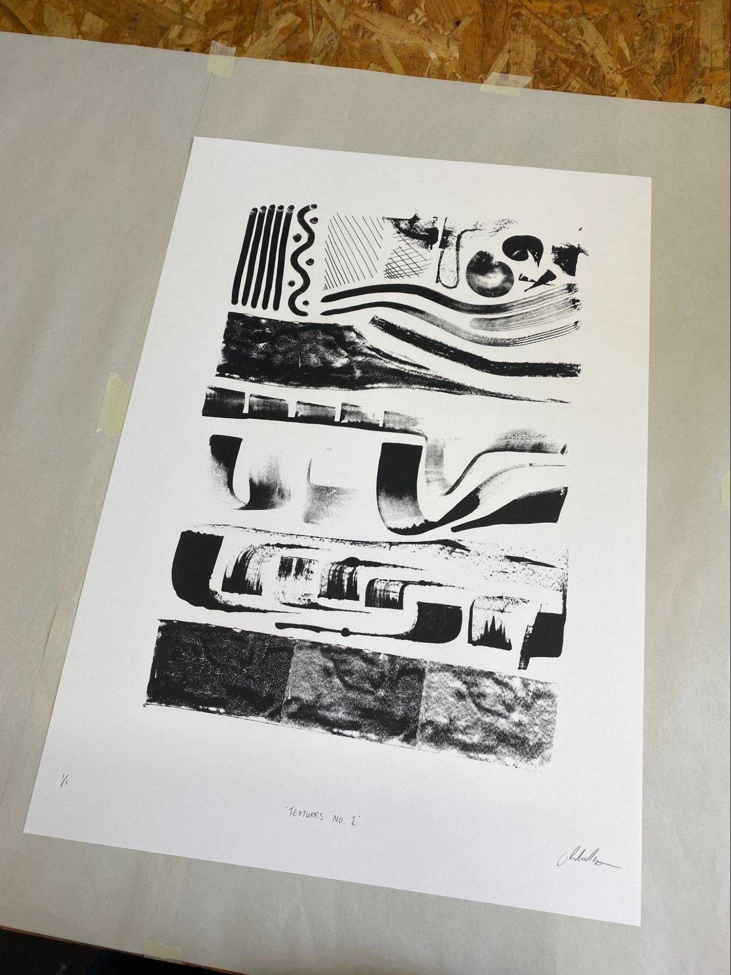
Textures Week 1 09/02/24
This month I wanted to focus on textures, a way of transferring lino to screen and riso. I started off Using water-based ink, 2 different sized brayers and multiple push knives. I manipulated the relief ink onto the page to create some mark making sheets.

These sheets were to be transferred onto screens. To do this I scanned each page into photoshop, adjusted light and dark balance using levels and added something called diffusion to the image. This essentially its a finer version of halftone, transforming the images into thousands of little dots
I made multiple sheets and chose my favourite to transfer to screen. One of the screens I used was Jude’s high mesh screen, this being significantly finer allowed me to pick up way more texture when printed.
The reason for starting this little project was to see how I could spice up my screen prints, i was finding that there wasn’t enough substance to my current prints and I was only scratching the surface of the process. Coming from an illustrative background, abstract forms and textures was something i’d always avoided until now, in some way visiting this was freeing to me as there were no restrictions.

This was a repeated texture using a slight transparent black ink, the large format was quite overwhelming to me so I decided on making a series of viewfinders to single out parts of the print, creating a series of small compositions.
Here they were..
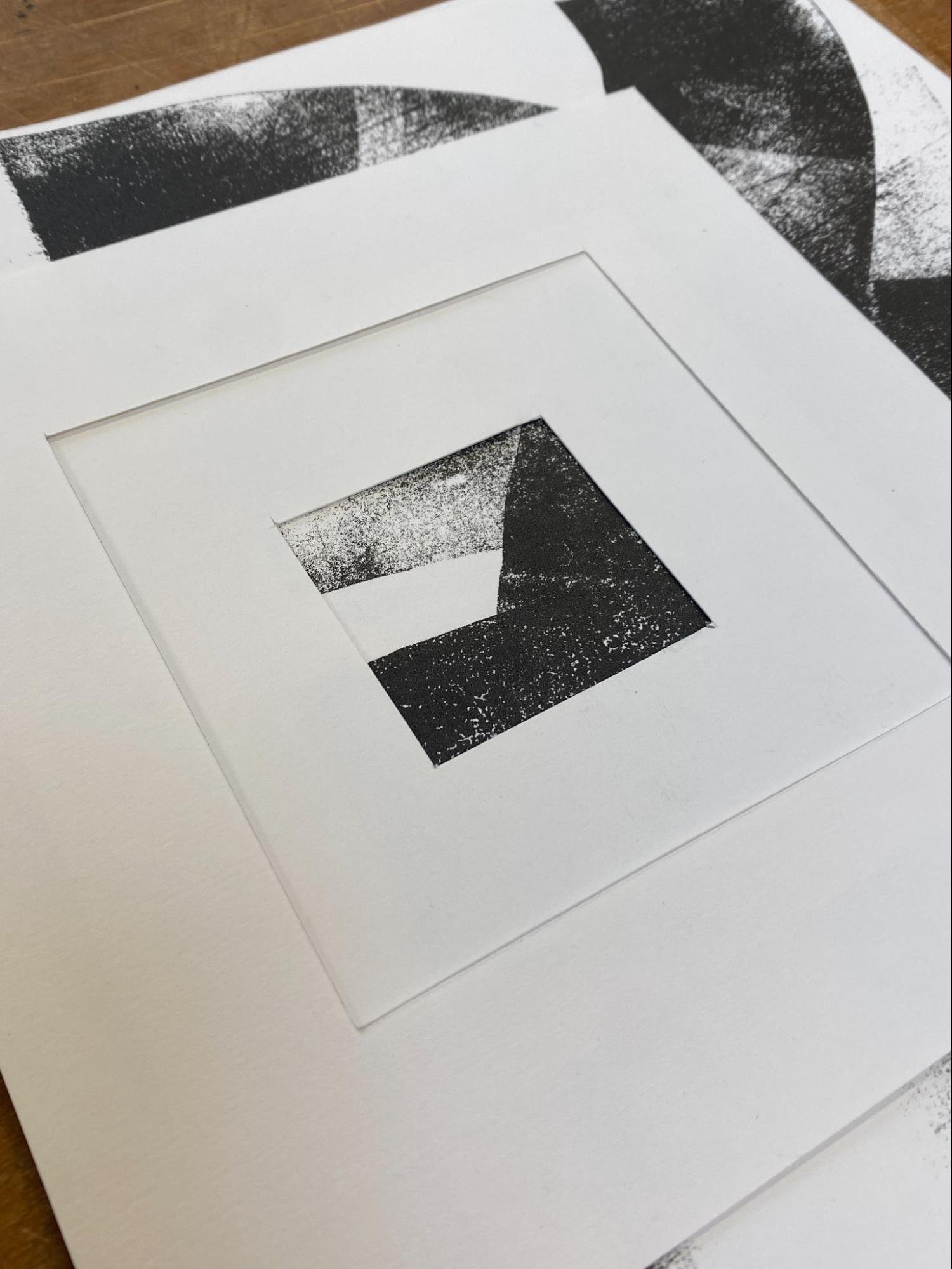
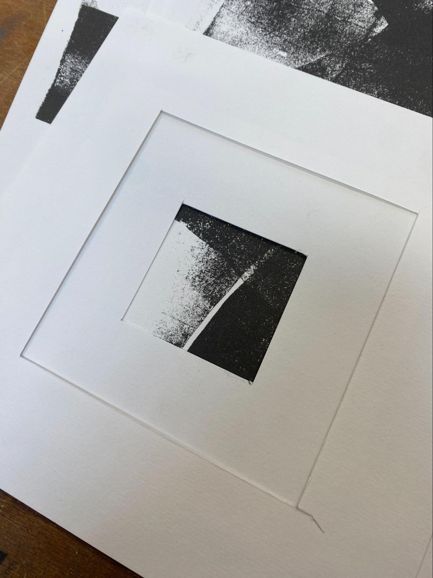
Super happy with these little compositions, it seemed like anywhere you moved the viewfinder something else interesting to the eye would appear. I continued with this for the rest of the session photographing my favourites.
Textures Week 2 14/02/24
In the next texture session, I wanted to explore more of the riso printer and how it would react to creating fine textures. This was the first time properly playing with the machine and it was really fun. There was a lot more to the process than I imagined too.
I started off by creating another view finder, this time it had 4 different squares spaced equally from one and another, cut out from an A4 piece of paper. Using my screenprints (also A4) and a sheet of clear acetate, i made a jig to create a small sequential series of miniatures.

The risoprinter has an intensity setting where you can change how dark or light you want the prints to be, for this i chose no. 2 which is the second to lowest setting in this regard. This gave me good clarity and interesting removed that semi tone which gave a stronger contrast.
I printed a few different compositions in red and blue, and then had the idea of combining the two, not only by overlay but also by using collage. These were the results of the overlay...

Slightly miss-registered which can be registered on the printer, i found it to be interesting especially the swatches which had more variation in contrast. I think it would be interesting to see how i could combine this is into my current practice whether this is in my screen prints or lino print.
This was one of the collaged versions..

I tried a few different approaches to this, one geometrical like this using the viewfinder to resquare, one with more fluid cuts and one with torn edges taking a looser approach. I also had a few rubber stamps with me so decided to print over the top of the image using an inkpad.
One of the things I don't like about printmaking is the waste that stereotypically comes from the process. As a printmaker I try to be as sustainable as possible, i keep all of my offcuts of paper to make recycled paper, reuse rolled inks, reuse rags and more. I also prefer to use materials like traditional linoleum because of its biodegradable properties. Alongside all of this i have also been keeping misprints, and during these sessions i had the idea to turn these misprints into miniature collages, one way of doing this is to keep them as ‘one offs’, or make them repeatable by either exposing them onto screen or scanning them into the riso printer. An idea I'd like to try and develop this year!
Two colour large fabric printing with my mum 17/02/24
Before joining the printhaus me and my sister had bought my mum vouchers for a printhaus workshop the previous year. Tom and Jude being as generous as ever, offered to run a 1 on 1 workshop with my mum doing some large scale fabric printing.
Our first job was to create our first swatch, my Mum decided on florals for her swatch so i got her to draw out a page of flowers and botanicals by hand. These were some of them..
I then scanned in the sketches and transferred them into procreate, from here I traced the flowers and started to create the swatch, when cutting up the swatches I decided to add in more florals in the gaps to make the repeat look more natural. For the second layer which would lie on the top, I decided on shrinking the swatch down to make it smaller and more delicate, in hopes that the bottom layer being a very tralucent print would create a but of texture within the design.
This was the repeated swatch printed onto inkjet film ready to be exposed.

From here me and tom prepped the screens and transferred the designs.
On the day, my mum decided on colours and we got mixing, prepped the table and secured the fabric down to the table. We then measured out all our registration marks to make it easy to print, ran through the process and got printing. It was super nice to get my mum involved in what I do and she had an absolute blast!
Here are some process photos and the final patterned fabric!
Homestead Show 18/02/24
For the show, myself, jude and Nigel from Amplifier press will be doing an opening show workshop, where member of the public will be able to visit Artmarket Cardiff and create their own ‘Pick n Mix’ Postcards using three different mediums of printmaking, Screenprint, Rubber Stamp and Letterpress.
There will be over 20 printhaus members displaying work at the exhibition, we were all given a set size of A3 and the theme Homestead, whether you take this literally or not is up to you. I decided to tie in my current prints of houseplants into this and as a homage to Wales I named the print, ‘Planhigyn y Tŷ’ which translates to ‘House of the plant’.
I decided on creating 5 lino prints, printed onto 220gsm Fabriano Rosapina paper, using Phthalo blue ink with a circular gradient in the upper half of the image.

Using new paper it was a struggle to find the right ink consistency as well as pressure using my Woodzilla press, as I have been printing on 160g snowdon which is very smooth for quite some. It was a challenge. I knew I could counteract any speckling of the print with either more ink or more pressure, but something I wanted to experiment with was dampening the paper, so I could not only get better contact between the paper and block but also a deboss within the print. At home I did not half a tray big enough to submerged the paper in so I used a misting spray bottle to do the same. Blotting the paper regularly using newsprint to reduce any obvious water droplets. This did in fact work with this larger scale print.
I didn't have any problems designing or cutting this block but I found the inking part hard. Half way through printing I made the executive decision to split the block in half so where the colours met would be a cleaner line, whilst making it easier for myself.

This was the finished print framed. Overall super happy with the results, there was a few slight mistakes to my eye but it is a hand carved and printed linocut.

Textures Week 3 21/02/24
With the idea of what i had in mind from the last session, i decided to gather some of my kept misprints, bring them into printhaus and cut them up.

Using a viewfinder like i had before i started composing these small collages from cut up parts, i then scanned them into the risoprinter and started printing!

I wanted to use the black drum for this and not overcomplicate the designs with bright vibrant colours or overlays.
These were some of the collages i created, i was super pleased with these miniatures and i felt like something had clicked even though they were very rough and ready, not only this but how I could make my work more interesting whilst being more sustainable.
Textures Week 4 28/02/24
I was pretty happy with the results from the previous week so I wanted this week to be a continuation of that, this time I brought in one of the misprints from my homestead edition. Used a scalpel and a pair of scissors to cut the image up, however this time I wanted to work in a more illustrative way, rather than abstract and create another botanical print.

From here I took a photo of the image and transferred it into photoshop where I then intended to convert it into an image suitable for screen print. This is how it currently looks..

I quite like the rawness of the image, the fact that it isn't perfect seems to add to it too. The image that i was using to start with wasn't perfect as the block had been overinked and the paper was too wet prior to printing, but again adds to this sense of rawness. I’d like to expose the final image (when it's ready) onto a screen and create some small scale prints of it. Using the diffusion feature on photoshop i should be able to keep all of those natural lino textures that you can currently see in the image. I could scan the image back into procreate and touch up a few bits too.
This Months Lino Prints
Im always creating new lino prints whatever im doing, i find that i don't like reprinting the same rolling edition when my stock depletes, this way the process is still exciting to me and im able to bring out new work in a constant flow.
This month I created three new linocuts. the ‘Homestead’ print above.
A heron using some offcuts of lino I had lying around…

The heron was a test of the new Fabriano paper i had ordered, i found that i was losing some of the clarity in the finer lines, this is because i couldn't apply enough pressure to the print, this is something i am still experimenting with. I’m visiting Jenny Gunning from ironbridge printmakers next month to test out one of their Gunning Etching Presses. Something I've been longing for quite some time. Maybe 2024 is a new press year..?! With the immense pressure these presses can achieve if set up correctly it might be the answer to a lot of my problems when it comes to creating that perfect print!
The third print i made was The Spinner, it is a Welsh lady spinning wool on her wheel, i drew this image with little reference and it had been a while since i’d done a figurative drawing or cutting and it was great fun!

Overall its been a great busy month and I found that setting myself these little projects really helped me grow within the studio and acquire so many new skills for my printmaking arsenal!
Show Opening and Acitvity, Artmarket Cardiff 09/04/24
For the opening of the show I got involved with prepwork and setup, before the folks at art market decided to start hanging the prints. Prior to this we decided on screenprinting the information poster and spot illustrations onto the Wall which was good fun and something i had never done before. Here's a little behind the scenes photo…

We were also running a free ‘have-a-go’ collaboration activity for members of the public. This consisted of making postcards and involved myself with rubber stamps, Amplifier press on Letterpress and Jude from the Printhaus, Screenprinting. The day was a total success and the turnout was great!
My First Print Exchange 13/04/24
On the sidelines this month, I designed and created a print for an upcoming print exchange I was invited to, - this year's 2024 Print Palooza. Hosted by Sally Craston and Australian Printmaker. The theme for the exchange was my backyard. With consideration that there would be lots of different printmakers from different countries I wanted something in the design to hint to Wales.

The given instruction for the print was, 14x14cm print with an image no bigger than 10x10cm. I needed to create an edition of 12 which would be sent off to Australia. One of everyone's prints from the edition is kept and exhibited at a local gallery in Australia. Later on in the year I should receive 10 prints back which I'm very excited about.
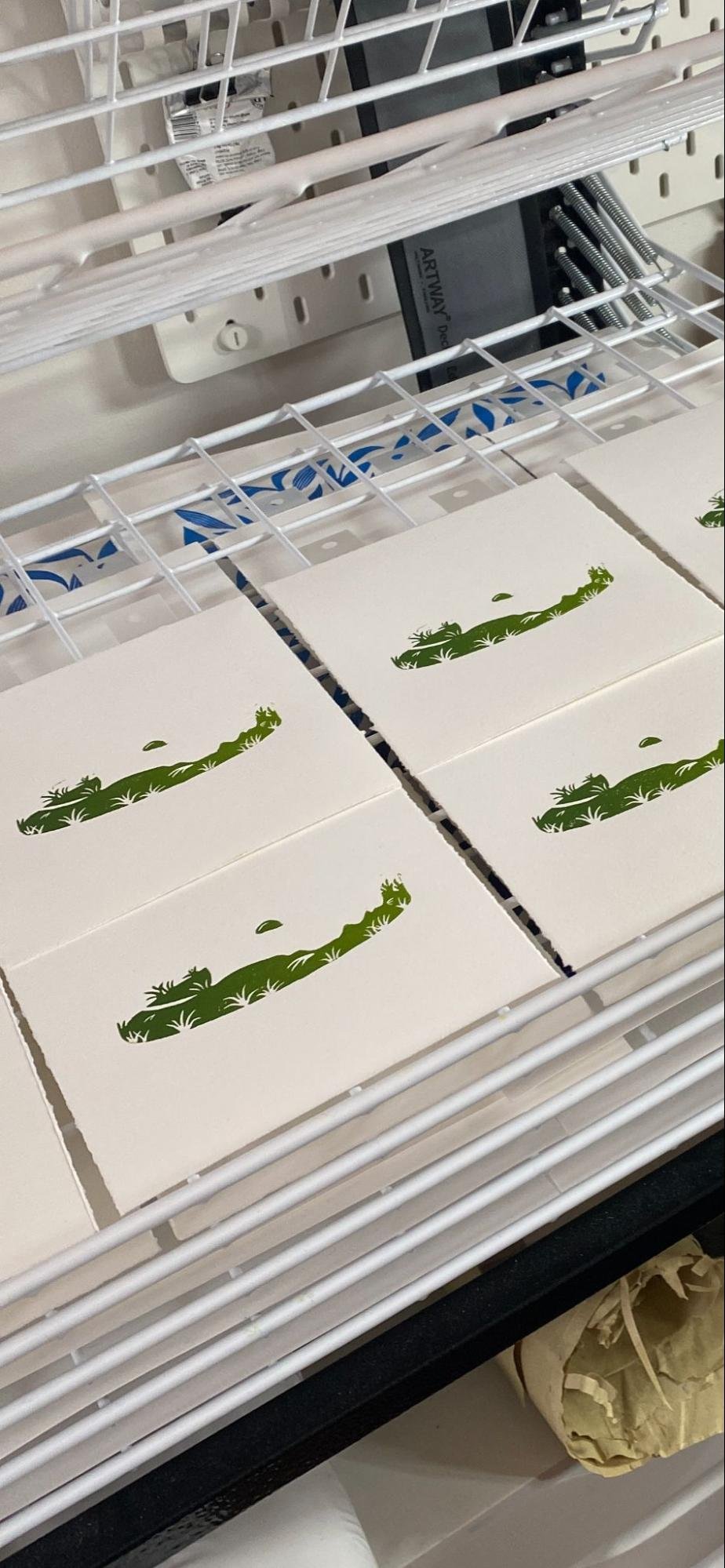
My main focus of the print is the king of my garden, my dog Reggie. I used Ternes Burton Reg Pins and a home made jig to register everything together. Decided on using Fabriano Rosapina 220g as the paper. These were the 3 layers with the third being the final print…
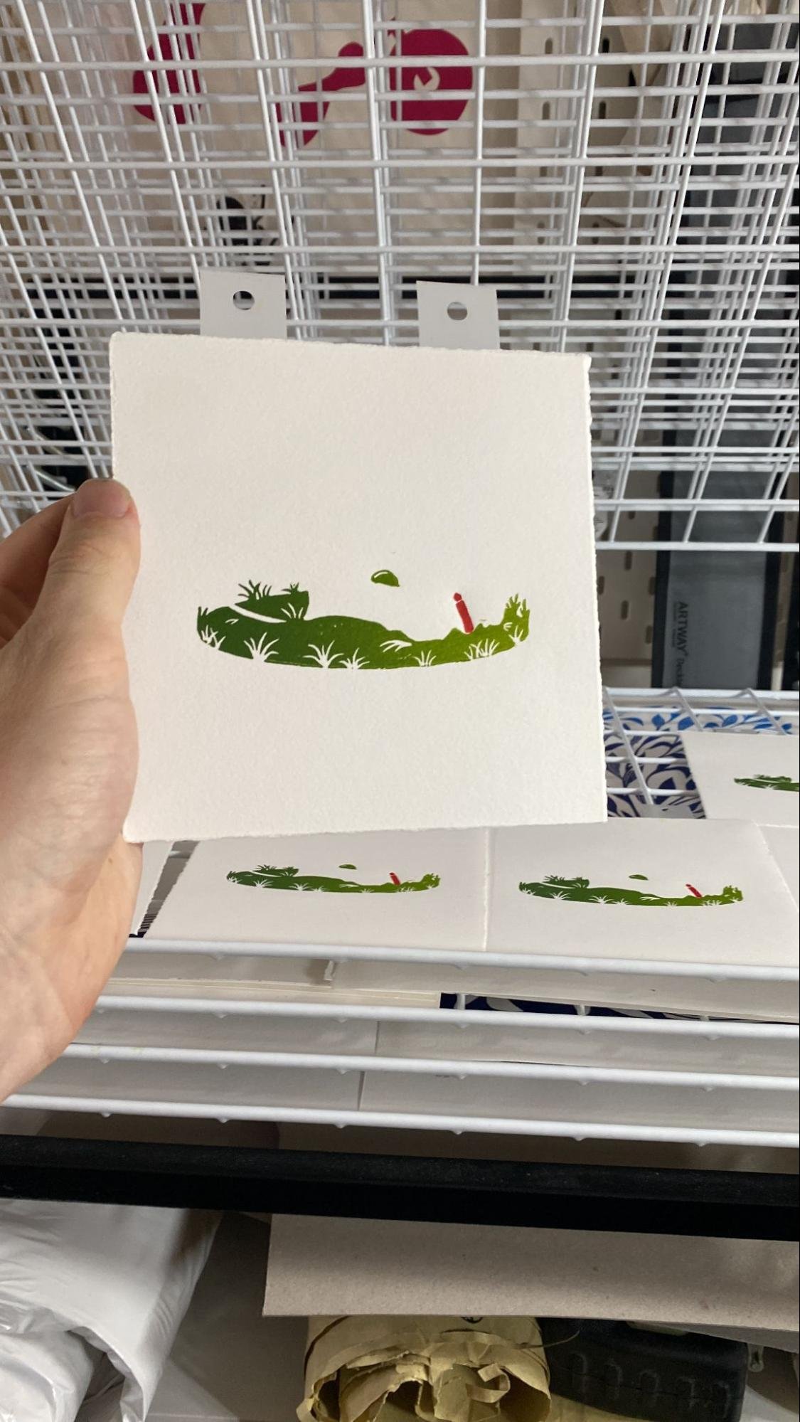
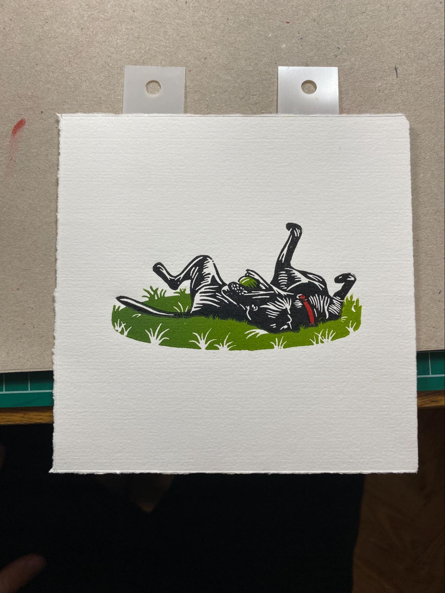

With the secret nod to Wales being the colour involved within the print, the same as the Welsh Flag..
Printed Festival 2024 Prep Start 20/04/24
For this year's printed festival I will be returning the rubber stamp ‘have-a-go’ activity that I ran last year along with Will Valentine. This year I wanted to add more stamps to the collection and add a new colour to the mix. I'm thinking of splitting the stamps into two piles. One being one colour and the other being a separate colour, so no colours are mixed in the inking process. I decided to create some rubber stamps around printmaking processes. My first lot of stamps will revolve around lino printing and I plan to make one around screenprint and risograph..


I’ve yet to print these stamps properly but I do plan to create a few reference sheets soon! I did however do some test printing..
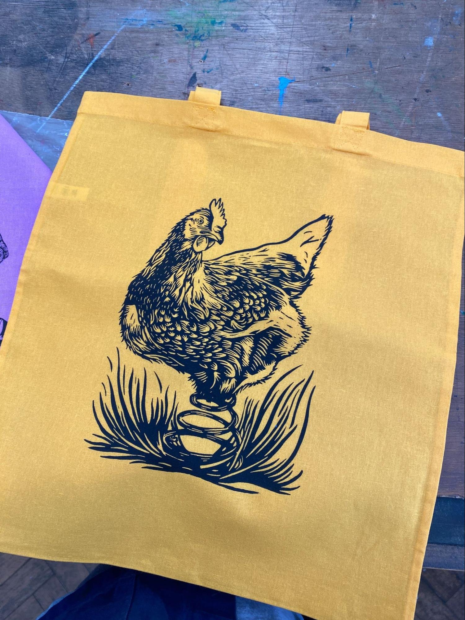
Spring Chicken Open Day Design 21/04/24
The next Printhaus open day is on its way and arrives on the 20th of next month! I was lucky enough to be asked to do another design for one of the Have-a-go print activities with the given theme being, ‘SPRING’. Immediately I thought of a cheesy, tongue and cheek design of a ‘Spring Chicken’ in the most literal form…

I drew this design starting with a quick few thumbnail compositions, converted it into a digital drawing on procreate and then transferred that image to lino. One of the things I want to explore more is transferring my lino prints to other print processes, like I have been doing with screen and lino. I could essentially submit the digital image but I find it loses the character within a hand cut print. After cutting and printing a short edition, I then scanned the image into photoshop, desaturated the image and adjusted levels and curves until I got the clarity of line between contrasts. One of things I feel you have to embrace within lino printing is all of those unintended marks.
My First Printhaus Workshop 12/04/24
Amongst the madness of this month, I also had my first printhaus lino workshop! I had 10 people attending, which in hindsight was maybe slightly too much for the time and space available. I learnt a lot from this workshop and can't wait to fine tune it to make it better in the next. One of things I plan to do is start with a limited colour palette, which would be presented to the attendees before the start of the workshop. Overall, it was great fun and the next workshop is up on the website already!! Massive thanks to Jude and Tom for allowing me to do this! Because of the pure chaos which unfolded I didn't get many photos of the finished outcomes but I do have a still of some of the prints from a video I took at the end of the night!

Bluebells Linocut 08/04/24

I started this month off with a new linocut, having been offered a place at next month's Art Market show. I wanted to create a new a3 linocut which I could launch at the start of may. Limited to just 20 prints in the edition, printed onto a new paper, in a new lilac color representing the purple hue you find in the flower. For this print I used a new (to me) paper, this being Hereford printmaking 145gsm. It’s a substitute for some zerkall papers which are not manufactured anymore. Its super smooth surface makes relief printmaking so easy, allowing less ink needed on the block which results in a quicker drying time. I think I will be using this paper for the foreseeable future until my etching press arrives. It's perfect!
Wood engravings 04/24

The Art Market call out was also a perfect opportunity for me to launch some of my first wood engravings that I have been working on this year. This month I returned to the process, creating this block of Porthgain as well as one of Brombil reservoir and the pembrokeshire coastline. I’ve created an edition of 24 for each which I plan to mount to be sold and frame for the show! Super happy with this little block and the prints which followed.

This was the final block I cut and printed this month, as I was running out of suitable blocks for the show, I decided to sand down the opposite side of the Porthgain block to a super smooth finish and use it to produce the Brombil print. I like the directional lines of the block and the way I created depth within the image using this technique. I'm seeing progress in the process which is something I am also enjoying!
Screen print mark resist test 13/04/24

With my screen print workshop just around the corner, I decided to run through the day to create some mental notes and timings as well as familarise myself with the process of using mark resist a bit more. I found that I really liked using mark resist, especially with creating painterly lines like the leaves within this print. I need to work more into the process which is something I plan to do next month. I find that for prints that have few layers like this one, it seems to create a more interesting image than printing something digitally using inkjet film, both definitely have their uses but mark resist works especially well for botanics!
Enlarging wood engravings through screen print 13/04/24
My first screen printing workshop 16/04/24
Super pleased with how the workshop went, always interesting and amazing to see how people get on with the medium and the use of mark resist film, which can be like marmite, you either love it or hate it! I felt it gave a good insight into screen printing and might be something I revisit in future as a beginner workshop. As the printhaus is predominantly a screenprinting studio, the difference in setup was night and day compared to lino making the whole session a lot smoother considering i hadn't done it before!

Open day 20/04/24
This was an interesting experiment for me. Playing around with scale and finding possibilities of connecting the two mediums together gave a new insight of the print!
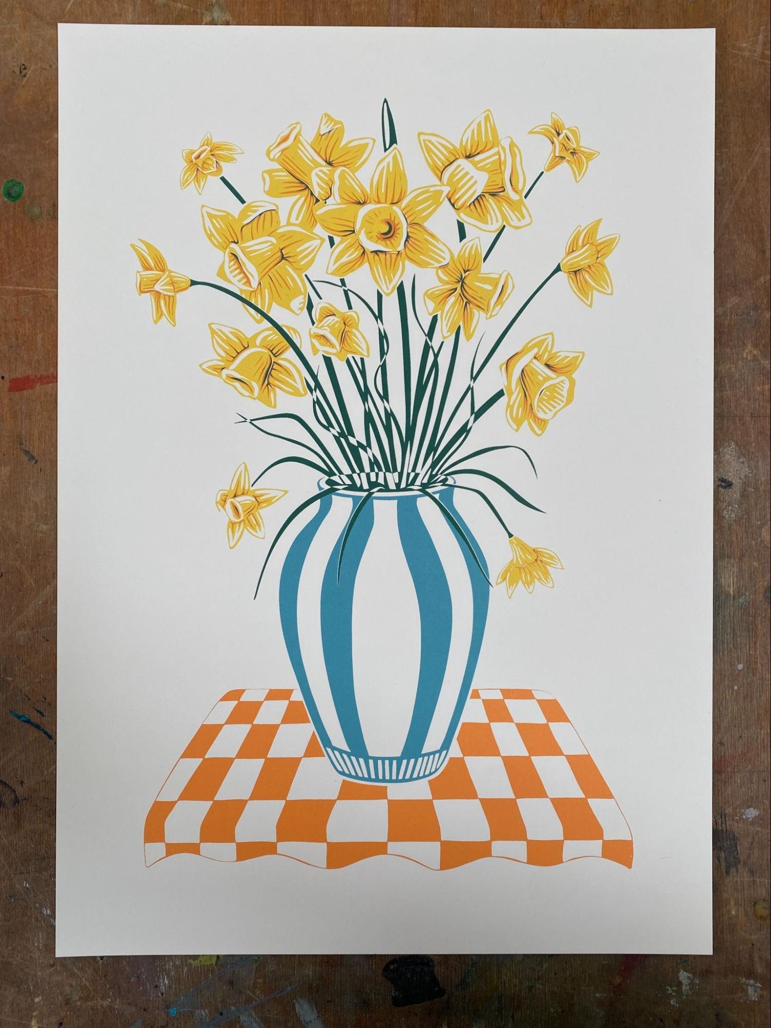
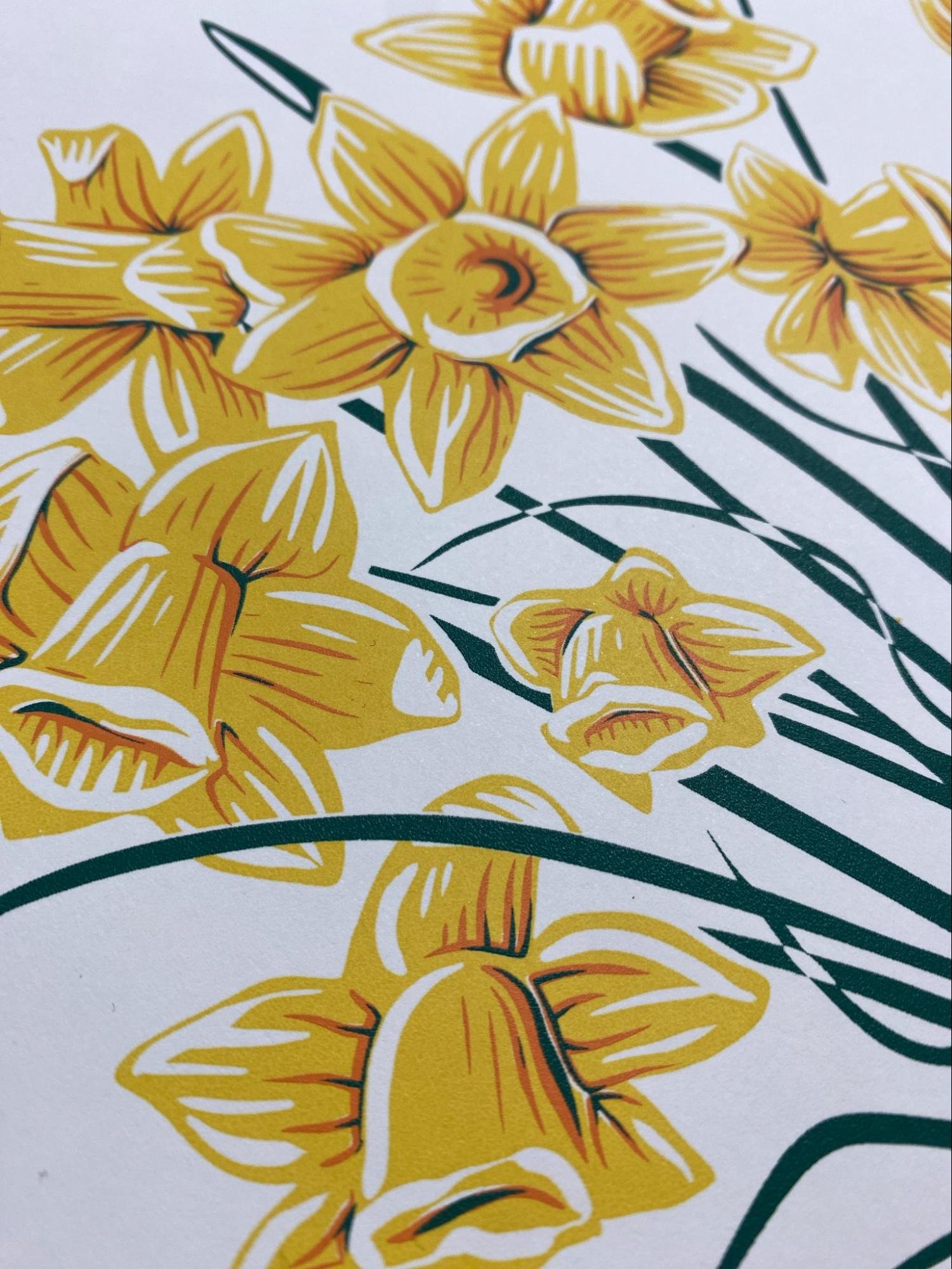
Daffodils screenprint 27/04/24
With this print I decided that I wanted to go the cut out route when formatting my layers for filmwork. This might have not been the best decision I had made as I gave myself a much harder job to register all of the layers together. The reason for why I did this was that I didn't want any colour variation on the overlay. One thing I didn't do was increase the stroke on each layer. In hindsight I wish I had done this, I walked into problems of gaps showing, which when i tried to fix them would cause misalignment in other areas of the print! But now I know!
250 Tote bags on carousel
A humbling experience which gave me insight into the difficulty of printing a higher number of bags! Super good fun and something I'd like to have another crack at!!

ArtmarketCDF May Show prep 04/24
Part of the artist call out show that I was invited to. Exhibiting 1 linocut, 1 screenprint and a series of 3 wood engravings of welsh landscapes that I had been working on. Really nice to be combining different mediums into my practice and not just linocut. For my wood engravings I decided on cutting my own double window mounts to house the prints and to be sold as a complete package.


I was super happy with how the edition came out. It was very long winded but interesting to dip my toes into the world of framing and mounting. Something that I haven't done much of before considering its importance to a printmaker like me!
and finally the series together framed!
Wooly Sheep tote bags 08/05/24
After printing the 250 tote bags for little gigs, I had the itch to do more. I really liked my wooly sheep linocut and thought that it would be a good start for me for tote bags. I started off by scanning my linocut and then transferring the scan into procreate where i printed off multi different sizes to gauge how big I wanted the design on the bag.
I then proceeded to open the pdf I saved from procreate into photoshop. Where I added registration marks to the top and bottom of the design, making it easier to line up on the carousel palette later on in the process. Printed off the filmwork using the inkjet printer and exposed it for 50-60 seconds in the exposure bed - making sure i had the correct placement of exposure on the screen for tote bags.
I also decided to add a quick label too. This was planned to go on the back of the bag but i later decided to print it on the inside of the tote! I also decided to colour match the blue to the print and contrast the label with a yellow for added pop!


Expanse show 08/06/24 16/06/24
As part of The Printhaus and being the hosts of the upcoming 2024 Printed Festival, we decided on having a studio show hosted in Artmarket Cardiff to be released on the first day of PF. The show was named expense relating to the theme given to everyone involved, it was entirely Riso based with a limited colour palette of Fluorescent Pink and Teal. The exciting thing about this show was not only getting everyone involved in another show but the arrival of our new riso printer the ‘MZ’, a two drum beast!
Here was the print framed up in the gallery along with everyone else's!
I really enjoyed working on this project and Riso is something I definitely want to start revisiting especially when work is getting busier. I cannot create so many editions of linocuts. I love the vibrancy and vividness of the colours and think lino and Riso go hand in hand with each other!

My print is the top right!
Jigsaw linocut workshop No.2 18/06/24
My second jigsaw linocut workshop went a lot smoother than last time, we whittled the number of 10 participants down to 6 which made a huge difference. I was able to give everyone much more time. I also pre choose the colours of the inks and notified everyone in the group when sending out the information email. This caused a lot less chaos especially when it came to cleaning up at the end!
I made a new demo block for the workshop, it seemed to give people a better idea of what I wanted them to do and achieve during the time.
Next time I would like to extend the time from 2.5 hours to 3 hours as I felt the end of the workshops seemed to be a bit tight on time. As lino tools are sharp it would also make a lot more sense to prevent people from rushing and accidentally cutting themselves with the gouges!

Creating a new stamp sheet for workshops and Printed Festival ‘24
As i will be running another have a go activity for this year's printed festival with the return Rubber Stamping I decided to add to the collection of stamps to total it over 100+ stamps. This sheet was inspired by the printhaus and contains everything you would find in the studio. The idea is to give people insight into what tools we use most in printmaking!
I ended up cutting each stamp out individually for the weekend!


colour matching relief inks to Banners
Another activity me and jude helped create was the naughts and crosses or our version, Squeegees and rollers for the weekend. Jude cut out giant stamps of squeegee and rollers, Tom made some handles and i colour matched the pink and yellow to create relief inks to be used on the 2 days!


Printed Festival Weekend! 8th and 9th of June 2024
I didnt take many photos on the weekend as I was absolutely flogged in the best way possible by all of you! Had an absolute blast and made so many prints with so many wonderful people! ‘Til next time, Printed Festival next time itll be even bigger and better than the last!

The Arrival of my NEW ETCHING PRESS 07/24
A very exciting day arrived at the beginning of July. My No. 2 Gunning etching press from Ironbridge Printmakers arrived on my doorstep, after a few month's wait whilst it was being built it was finally here and the word excitement could only be described as an understatement!
It didn't take me long to get it into my studio setup ready to print! It came at the perfect time as I had been invited to do another show, The Canton Flower Show, again hosted by Artmarket Cardiff! For this show I wanted to create my first A2 Linocut, something I had wanted to do for a long time but didn't want to dive into until I had a press that could accommodate this size of print!
Here’s a photo of the edition alongside Big Blue my Etching press!! Also look at the size of that wheel?


Underneath is a picture of it framed! In total I made 6 prints especially for the show and I am ecstatic to say they all sold, so thanks so much to everyone who bought one!
Shortly after knowing i sold the edition i decided to make more which i am keeping safe ready for the christmas bombardment of Christmas markets i plan to attend!

Some other linocuts of the flower series I have been working on! This series will be displayed in my very own solo show next year at Artmarket too. How exciting?!
Marigolds and Helniums printed onto 145g Hereford printmaking paper.

Monotype Screen Printing 08/24
As I am now running the Pay As You Go sessions at the printhaus I had a few questions about monotype screen printing during the sessions. Something I knew about but didn't have any personal experience with!
Due to this I decided to give it a go on a large scale, in a monochromatic colour palette as part of the ‘MONOCHROME’ project Jude had set for me! I created a short series of individual 1/1 monotype screenprints by painting directly onto the screens using painted brushes, after doing some research and learning from the best Mr Rikki Hewit I learnt that foam brushes were key to get flat and smooth lines.
Here are the prints! I really enjoyed this loose style of working and the idea of playing within my practice! I found that framing certain parts of the print using beveled mounts was super effective too… I felt it not only worked on a large scale but also on a smaller scale similar to how I mounted my wood engravings! So many possibilities and new compositions at this scale..


Creating tablecloths for Printed Festival and external workshops 08/24
Today we created new tablecloths for external workshops and ‘have-a-go’ activities, we used the fabric table in the upstairs studio and prepped and shot multiple screens with different designs on. To start with we used spray glue to give the rubber table surface a bit of tack so that the fabric would sit flat and not move when printing. We composed our filmwork on top of the fabric to get correct spacing between images and then registered through the screen by placing the screens on top by lining up the photo stencil to the filmwork. It was a success! We ended up making two table cloths which have been brought to many of our external workshops so far!

20:20 Print Exchange 2024 09/24
When I joined the printhaus, one of the first things I heard about was the 20:20 print exchange and the involvement of the studio for last year's event. I’m super happy for it to be back this year and wanted to create an entirely new linocut edition for my entry.
At this point i was finally getting to grips with using my etching press, i managed to create a near perfect edition of 25 without many overs which i was super happy with! I had been struggling with ink consistency which was causing slipping under the pressure of the etching press. To make them more tacky, magnesium carbonate/french chalk needs to be mixed into the inks which solved the problem! A big thanks to Jenny Gunning of Ironbridge Printmakers for helping me out!
For the print I hand mixed a coral orange which has a lot of red in it for the print, resembling one of the hue’s you’d find in a dahlia flower head. At this point I was still using loose ink so to counteract this I rolled out the ink so thinly on the block using a very hard rubber roller. Only issue with this is that it affects the opaqueness of the colour making it seem lighter on paper than it actually is!
One of the things I love about having a press of this quality is the emboss/deboss that is created through the pressure of the press. Especially with a medium gsm paper like this 220g Fabriano Rosapina.
Overall I was super happy with the entire edition, now they are sent off. I can't wait to receive the exchanged prints!

Lino derived riso prints 09/24
Linocut derived riso prints was something I wanted to dive into for quite a while now, but felt like none of the prints i had previously made had the potential. I found that lots of people loved the sunflowers, but because of the paper i am using i didn't want to roll the prints when packaging, if I were to sell them on my online shop.
I decided to make a smaller A3 edition, in a single colour of teal! I ended up producing an edition of 30 prints but later noticed a slight misprint with them. One thing I forgot to do was remove the background in the layers section on photoshop. For some reason the printer picked up an invisible layer somewhere in the file so there is a very faint flat image in the background of the print! Very annoying but almost unnoticeable. This Edition will be sold as ‘seconds’ but I will be revisiting this soon!

My 2024 Summer Market Stalls
Over the summer i didn't apply for many market stalls but these were two i did attend, CYMK festival and Spit and Sawdust’s Indie Night Market.


Experimenting with gradients within riso printing! 09/24
A quick experimentation of using gradients within riso printing. This was something I hadn't done before within the process and was told about by Gavin our Riso wiz at the printhaus when testing out a workshop! Sticking with the theme of florals for this one and playing around with gradients and overlay I think it was definitely a success for the test and will be something I revisit soon. Maybe even building upon this very design!

1 to 1 session with Maki for her solo show 09/24
Now working in the printhaus part time helping out with screen cleaning, shooting and overall workshop maintenance, as well running the pay as you go sessions and managing the membership rules. Something else I wanted to have a go at was a 1:1 session with one of our members. Maki had a show coming up the following week and was struggling to print her larger pieces for it. So we booked in two 1:1 sessions over the weekend and printed for a solid ten hours. It was fun working at this large scale on paper. The only time I had ever printed at this scale was on fabric, it was my first time using the mechanical arm on the large flatbed and the whole project was a complete success.
We printed an edition of two separate large scale 2 colour prints and an edition of one 4 colour prints! I learnt so much during the session not only from a technical perspective but also a tutors perspective. So thank you maki!


PAY AS YOU GO SESSIONS and becoming a workshop technician 05/24 - NOW
Since May i have been lucky enough to be solo running the Pay-As-You-Go Sessions at The Printhaus, there are six 3-hour sessions a month where members attend and I have the job to give them light support with whatever they are working on. it’s been a blast so far and I have learnt so much, not only technically but also from a tutoring perspective. It has given me so much confidence and I can’t thank both Jude and Tom enough for the opportunity.
I found it super interesting to work with all of these people, learning about how much information I need to give them without bombarding them with too much. Learning how to distribute different amounts of information to different skill levels has been challenging but I find myself improving as each session goes by.
Within these sessions, my job is to not only look after participants but also look after the studio as a Studio Technician, a job which I have always wanted since becoming a printmaker. Jobs include; care of equipment and machines, chemical care, recycling used screens, prepping and shooting screens for commercial jobs and so much more! The list is endless and I have love every smidge of it!

membership renewals 08/24 - now
Another job which I have taken since being here is Membership Renewals. Since August 2024 I have been looking after the members, whether they are newcomers or veterans of The Printhaus, my job is to keep tabs on who is coming into the studio and who is leaving. I take care of reminding people that their subscriptions are up for renewal and help people choose what membership is right for them within their printmaking journey. It has been humbling at times but I enjoy it, which proves that sometimes you have to jump into something with two feet!
Now in October, I have shadowed Jude within one of the Screenprint Inductions proceeding to take on the induction by myself next month. Here I will be explaining what this communal studio is and how it runs, giving participants their first experience of The Printhaus, arguably the most important thins to get people to sign up!
