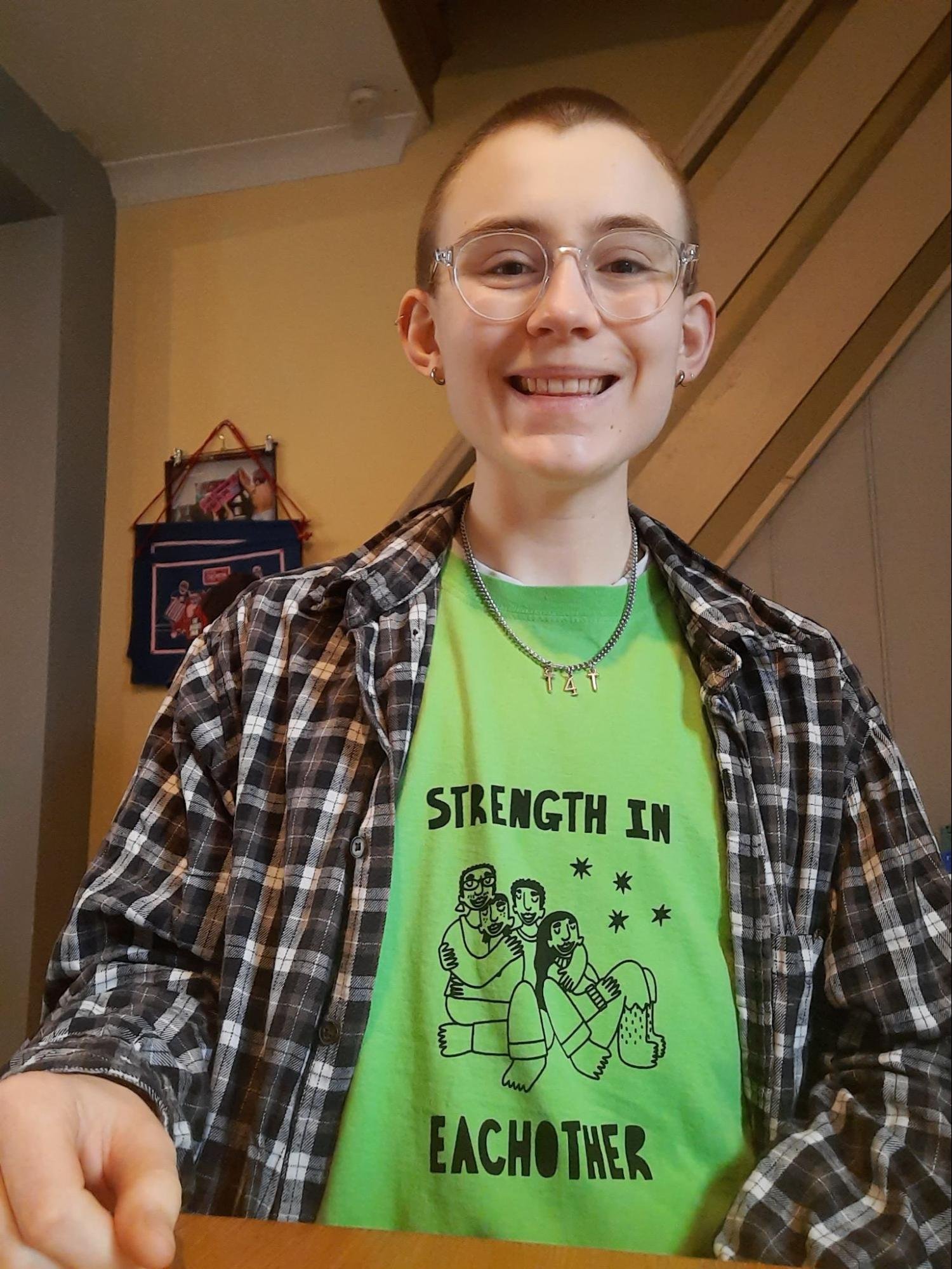
SEREN’s journal
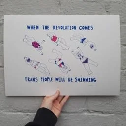
I’m Seren and I’m just starting out on the Printhaus mentorship. I am an artist and illustrator from Cardiff whose work centres trans experiences, bodies and relationships. I was inspired to start making and sharing art by the incredibly creative trans community I am a part of during an especially difficult time in life. I make art for non-profit community purposes and I’m supported to do this by also doing freelance work for individuals and organisations. My main aim as an artist is to make work that gives trans people hope and makes them feel seen, and I’m just picking a lot of things up as I go!
I didn’t have a clue what screenprinting was until about a year ago, when a friend mentioned in passing that learning to do it could be a cheaper and more sustainable way of making t-shirts with my art on. Once I started looking into it, I fell in love with the whole idea of screenprinting. I tried out an evening class at Cardiff School of Art and Design, and I realised that screenprinting suited my artistic style in a way that just seemed to click. Now that I can imagine things coming together in a medium that just seems to work for the sort of art I make, I feel more and more inspired, and so excited to have the opportunity to experiment and learn and build my confidence and knowledge.
I’m hoping to start by really getting the basics down, and then move on to some quite big projects, including a short story book/zine, a run of t-shirts and some massive posters. As a self-taught artist who doesn’t really feel like they know what they’re doing when it comes to the more businessy, networky sides of creative life, I’m also looking forward to talking more about these sorts of things and getting to spend more time with Printhaus members in general. It feels like a huge privilege to have the chance to develop my skills and experiment with printmaking in such a lovely creative environment and I can’t wait to see how things develop over the mentorship.
Session 1: 2 February 2023 - From Start to Finish
My Project
I am hoping to make some two or three colour posters with illustrations and text as I go through the mentorship, especially an A2 poster of a tarot card deck I am designing. I thought it would be nice to start the mentorship with a much smaller and simpler A4 design, and to focus on the process as a whole before exploring more technical aspects in detail in further weeks.
Technical
In this first session, we covered the whole screenprinting process from coating screens to producing a final two colour print on paper.
We spent a bit of time on Photoshop setting up the filmwork, adding registration marks and laying the designs out in a way to conserve as much of the filmwork sheet as possible. This is something that I am really unfamiliar with, and I find Photoshop quite complicated and overwhelming, so I appreciated spending a while talking through all the steps, and am looking forward to practicing it more, especially in these early sessions. I’d planned to make a three layer print, but when we went to set up the screens we realised that one of the layers had a design error, I hadn’t blacked out certain parts of it, so we had to change plans and make a two layer print instead. We also realised that the image sizing, intended to be A4, was actually A6. Both of these changes were silly mistakes I’d made when rushing to prep my design the night before, but they feel like good examples of how screenprinting is really not a thing you want to rush, there are so many steps and small details to take into account that you really have to keep your full attention on everything.
We also talked about paints and types of paper, and what sorts of colours work well together in a print. I’ve rarely used acrylics (or any paints) for making art before, so I am not that familiar with how they work, compliment one another, or change when they are printed. We talked about how screenprints usually only include around three colours maximum, and that contrasting colours often work well together - so I went for a clashy hot pink and blue. Jude suggested recording colours that I like and think compliment one another in a notebook to get myself thinking about this more. We then set up the screens and printed the first layer of the artwork, before Jude left me to set up and print the second and final layer on my own.
Wrap-up
The session felt like a really fab overview to kick off the mentorship. It was lovely to meet some other members along the way, and very satisfying to walk away with a two colour print at the end! I had so much fun, and I’m going to come back into the studio next week before the next mentorship session so I can go through the whole process again using some different colours and refresh my memory about all the steps. It feels like repetition is so important for getting to grips with the basics of screenprinting, and every time I go through it all I feel my confidence build a little.

Session 2: 10 February 2023 - 3 Colour Print
My project
During this session we focused on the same print as previously, fine tuning some details and adding in a third layer, just to really cement the process and come out of the day with a clear comparison between the two sessions.
At the end of the session, I’d made my first three colour print and spent some time playing around with different colour options. It is feeling really good to experiment and try things out and see where they take me before beginning the bigger ideas I have for projects. I think this experimenting, finding out what I want to try and where I want to improve, will carry on for a while longer before I feel ready to dive into the main projects.
Technical
We spent a lot of this session going over photoshop, talking through each step to set up filmwork for printing, and writing all the information down before going back over it myself to make sure I understood. I’d asked if we could do this work specifically, since I find Photoshop quite overwhelming and hard to understand. I’ve seen others use it briefly before, but it was so good to go through all of the steps slowly and break it all down. I came back into the studio the following week to practice using running through the process again, and found it much easier. Even when little things weren’t quite right, I had the confidence to work them out myself without panicking that I didn’t understand and couldn’t fix it.
We also ran through how to remove emulsion from a screen, which was something I’d never done before and was surprisingly harder than I’d expected. I basically probably should’ve put more remover chemicals on the screen and left it a bit longer, rather than spending ages very slowly washing all the emulsion off. But I guess this is how you learn!
Finally we went over setting up on the flatbed for printing. Even though I went into the studio the week before to print and had set up on my own without any problems, when I came to do it this session, I found that I’d blanked a number of the steps within the time out. It just showed how important repetition, familiarity, confidence and taking your time are. A week after the session, I came into the studio to repeat the process again, and this time I could remember everything so long as I gave myself a moment and didn’t rush.
Wrap-up
I really enjoyed making this three colour print. At the end of the session, I knew that next I wanted to work on improving my registration and lining up layers.


Session 3: 22 February 2023 - Improving Registration
My project
Today I tried out making an A3 two colour print of a new poster design and working on getting the registration for the two layers as perfect as possible. Trying out different posters in different layouts, sizes and styles has been a really helpful way for me to start thinking about where I want to develop my screenprinting skills and the sorts of prints I want to make.
Technical
This session we worked on registration. Between sessions, I had been trying out printing some new designs and had found that I was struggling with precision in lining up different layers when printing. I personally like a slightly wonky vibe to my prints, but I’d like to know how to line everything up perfectly, just in case I ever change my mind!! I prepped a design in advance and Jude showed me how to thicken the design lines on Photoshop so that the design was more forgiving to slight movement. This was super helpful, as my designs often have very fine linework and this makes it all the harder to get all the layers lined up, and it isn’t noticeable to others.
Then we looked into how to set up a screen to help with the most accurate registration on a flatbed. We spent a while lining up the screen with design underneath on the bed as close as possible by eye, and then tweaked it using the micro registration notches on the bed. Then we set up the artwork on the bed using dynamo tape to register the print - this was so much more accurate and easy to use than the masking tape I’ve always used before, because the dynamo tape is thicker and makes a sort of groove so that the paper just slots into place. It’s cool that you can feel when the paper is in the right place and don’t just have to use your eyes like you do with masking tape. It’s amazing how a slight movement can knock the registration right out of whack, and I found it so much easier for keeping the paper stable. We also used a lay sheet so that I could double check everything was lined up properly before each new print. I also found this way of registering has improved my registration skills in general - probably also combined with a fair amount more practice!
One new problem I found during this session was that the print kept blowing out on the bottom right corner. This design was the widest I’d ever printed and involved using a bigger squeegee than I’d used before. Jude suggested that, in future, it would be easier to print the design sideways (portrait), and as I thought about it, it seemed obvious I should’ve done that! It is easier to print a long and thin area than a short and wide area because of the pressure you need to put on the squeegee. I was a bit disappointed with the blow out but I was so pleased that we’d got the registration on point. I shadowed Jude on a commercial print job the following week and learned how to use a mechanical arm on a flatbed, which makes it much easier to print larger artwork. I found it quite hard to control the arm at first, but once I got the hang of it I could see how it could make things more consistent. I’m hoping to start working on some A2 or A1 posters soon, and the mechanical arm could definitely come in handy.
Wrap-up
It felt super rewarding to improve my registration skills during this session, especially as it was one of the things I’d been struggling with most when coming into the studio on my own. It feels really exciting to build my skills and knowledge in a way that inspires me to think of new ideas for projects that I want to try out. Every time I come into the studio now I feel more and more confident and excited about printing


photo of blow out on letter G
Session 4: 10 March 2023 - Printing banners
My project
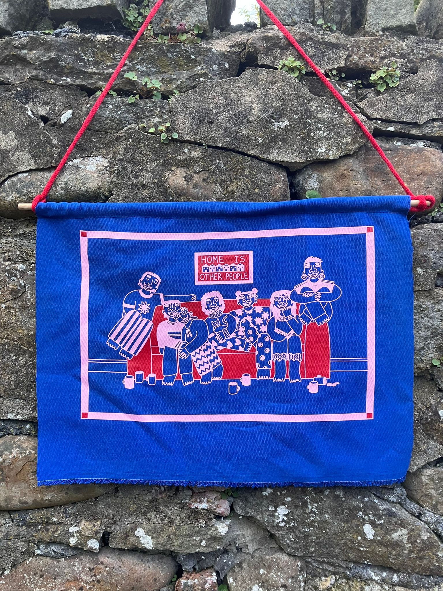
Today was my first go at fabric printing as part of the mentorship. I’d tried it once before on a t-shirt printing course with Tom, and had really enjoyed it, but definitely encountered some problems along the way. I decided this time to print on some small A3 banners/ wall hangings, because I’ve been wanting to make some for a really long time, and I felt like trying something a bit different from t-shirts. I’d love to make more banners in the future and it was so fun to try it out in this session.
Technical
I had prepared the filmwork and screens in advance so we could just focus on printing, and it is so nice to feel so confident in doing this compared with just 6 weeks ago. First we took a look at how we would register the banners on the carousel. They were hardly banners and more scraps of fabric at this stage, so we used a straight edge on the fabric to line everything up. I’d decided to do a two-colour print purposely to work on registration techniques but the second ended up adding depth to the print in a very nice way anyway. I had totally forgotten how to set up screens on the carousel since my short fabric printing course back in the summer, and it felt a bit overwhelming going through it all. I’d got so used to feeling confident doing paper printing on flatbeds that it felt a bit jarring to try something so new and different. While there are definitely similarities in how you set up and I felt I had got a bit more of an idea of it all by the end of the session, printing on the carousel feels like something it will take me a while to get confident in doing without someone more experienced being around. We also went through how to turn on the flash unit and tunnel dryer, and the technicalities of how to use them - again things it is going to take a while to get used to!
I took a while picking paint colours (my fault for not thinking about it in advance) and it was cool to learn about pantone and the difference between coated and uncoated inks (for fabric vs paper). Once I had an idea of the colours I wanted to go for, I feel like using a pantone booklet was actually really helpful, especially when there are so many colours to choose from, otherwise I can get a bit lost in the choice of it all.
When it came to printing, I found that the paints I used were not only thicker than paper paints (as fabric paint is meant to be) but they were extreeeemly thick, a bit old (probs with too much pigment according to Tom) and more difficult to print with than I was expecting. This led to a bit of blow out on the screen and a couple of the prints, perhaps because I was pushing too hard on the squeegee when trying to clear the thick ink. The blow out happened to me before when I was doing the t-shirt printing course and at the time it made me very stressed!! I feel like this time I understood a bit more about how to clear the screen, wipe off the excess ink and recover from the blow out. In future I would also make sure to use bigger screens. I had just grabbed the first 43T I saw rather than thinking about the actual size of the screen and how, even if my design would fit on it comfortably, it might not be comfortable when it actually came to printing. Going forward it’s probably better to have one that is too big than too small so that the paint doesn’t all get mushed into the sides of the screen.
Wrap up
I really enjoyed trying out fabric printing in this way. It was definitely quite an adjustment after getting so used to paper printing, and I feel like I need a fair amount more practice in fabric printing before I would feel anywhere near as confident as I feel with paper printing at the moment. But it was so fun and rewarding, and the banners that have come out of it are some of my favourite things I’ve ever made.
Session 5: 28 March 2023 - Carousel training part 1
My project
I wasn’t quite sure what direction to go in after the last session, but after a chat with Jude and Tom, we decided to do a crash course in fabric printing on the carousel to get me using the machine a lot and hopefully getting more confident with the processes as a result. For the first of these sessions the main focus was on working on a simple commercial job printing using black ink. Once I’d got into the groove with this job, I would then do a small batch of printing of my own design. I made a super simple one colour design and brought along 5 tees to print on.
Technical
First we went through different screen types, including differences in mesh colours and mesh counts, and how the exposure times reflect this. I learned that ultimately 2 mins will be ok for most screens being used for fabric print. I did 3 minutes for my design this session because my design didn’t have much detail and the line work was quite thick.
Then we got started with the commercial print job to build up good muscle memory through the repetition of the job. This involved doing 100 front left chest prints on white t-shirts using red ink. It was a small print area so I had to hold the squeegee with one hand to keep a good level of pressure. I also had to stand to one side. This felt quite different from my usual experience of printing head on using both hands on the squeegee, but once I’d got used to the feeling and got into the rhythm of the job I felt pretty confident with the printing, flooding, and removing the t-shirt from the board to put in the dryer, despite the occasional slightly imperfection in the print. I also found that I was able to notice tiny mistakes much more quickly and easily as I went along. The first 70 t-shirts were loaded onto the boards for me, and then when we got to the final 30 I loaded these myself and Tom checked their registration before I printed. I got some properly loaded, but I often struggled to get them completely central - they were straight on the board, but slightly off to the left. Hopefully this accuracy will just come with time.
Then once the job was done I did a quick run of my own designs. I felt confident setting up alone and registering the design, and then printing was much easier and more fun. Obviously I didn't do many, but having the experience of printing a bigger commercial job first made it feel like a breeze and was a cool way of being able to compare that working on that print job with how I might work on my own work.
Wrap up
This first session in carousel training has already boosted my confidence and knowledge of working on this machine. I think the idea of doing a more intensive job followed by something small (and perhaps more applicable to your own practice) is a really good way to see your own improvement. I’m hyped to do more of this crash course.
Session 6: 18 April 2023 - Carousel training part 2
My project
Building on last session, the plan for this week was to do another relatively simple commercial print job, but this time printing with white ink on dark fabric (rather than black ink on light fabric, which is what we did last week). The difference here is that you need to add two layers of the white ink, allowing them to touch-dry in between. The plan was, like last week, to do a commercial job and then apply the same learning to a short print run of my own design. There were differences in the commercial job and my own design - the print for the commercial job was a small left chest design, whereas the design I had made for my print was a massive A3 size image. This meant I actually had to apply some different printing techniques to each, but there were things I learned from the commercial job, including issues of pressure and angle of the squeegee on different pulls, that were actually super helpful for doing my own design after.
Technical
First I learned how to set up and change the boards on the carousel, and which boards to use for different garments like t-shirts, tote bags and tea towels.
Then we moved onto the commercial print job. It was only 10 t-shirts of varying sizes, but because they needed to be printed twice this meant they took longer than if I was doing the same amount of t-shirts with black ink. It was interesting working more on using the squeegee with different angles and pressures for each pull, two pulls on the first round (one hard, the second a little lighter and the squeegee at a higher angle) and just one on the second (also a relatively light pull compared to the first one). I felt like I understood a bit more how the ink actually works in the screen and how to control it, and by the end of the run I felt very comfortable with the rhythm of it all. It was really satisfying.
Then moving onto my own design, this was a much larger surface area to print on, probably my biggest yet, and required a lot more strength and pressure. It felt like much harder work physically to get the print and pressure consistent. It took a while to get the technique right for this, but following the same sort of pattern (one hard pull, one lighter and higher pull, dry, one lightish pull) worked well, it was just adapting to the much larger size, and once I was in the groove with it I again felt comfortable. I think it’s all about getting into a rhythm with it for me, if I can break through the initial uncertainty/wobbly start, it will generally be ok!
Wrap up
I do feel much more confident with carousel printing. I feel like I would almost be ok coming in, setting up and getting started fabric printing on my own. I think it’s more the issue of if something goes wrong, I might crumble a bit. But understanding more about how the ink works every session and how to troubleshoot little problems with the print is definitely helping. Every week is definitely building on the previous. Being able to print on the carousel is super important to me, as printing and upcycling old clothes is a big part of my vision for the art I want to make. Because of this it is really reassuring to feel like I’m getting more confident in this.
Session 7: 17 May 2023 - Carousel training part 3
My project
This was the final session training on the carousel, basically just going over everything I had already learned and trying to work more independently. Thanks to these sessions I feel like I’ll be able to come in and use the equipment outside of mentorship time now. We worked on a simple commercial job and then I did a small run of t-shirts, printing a light ink on dark fabric. It is definitely the most confident I have felt so far doing fabric printing.
Technical
First we worked on a commercial job printing a one colour print on totebags, half the stock in blue and the other half in orange. I set up for the commercial job with some guidance on what works best for design placement on a tote bag. Then we discussed how to mix colours to match the design using Pantone. I doubt this is something I will do much of at least for a while, as I usually just pick the colours that are already premixed and available in the studio, but it was interesting to understand and try out. I turned on the flash unit and tunnel dryer, and then I started printing the one colour design, half in blue and half in orange. This was the first time I’d printed on tote bags before, so it was useful that I had helped Tom out with a workshop the week before where people had been printing on tote bags, so I had learned quite a bit from that. I find totebags much easier to load than t-shirts, because you can get the position of the fabric on the board into place accurately without too much effort. I think there’s much more of a knack to it with tees. This run felt pretty easy to be honest. When there were certain areas of the print where the ink wasn’t coming through how I liked, I felt I was ok to adjust it, usually with a little guidance from Tom. But it was the most confident I have felt doing this.
Following that, I was able to set up my own design and print my 7 t-shirts basically all by myself. I was printing cream on dark blues and greens, so I had to do two layers of ink, drying in between using the flash unit. I usually print my designs on second hand clothes, which sometimes means they are a bit bobbly and the ink doesn’t always sit as cleanly on them as it would on new garments. This sometimes bothers me a bit, as I think as printers you get used to looking out for the most minute mistakes, but I have learned to get used to the idea that these sort of garments aren’t going to look exactly the same as brand new ones. And anyway, I was still really happy with how they turned out.


Wrap up
I feel super happy with how these carousel training sessions have helped me develop my knowledge and confidence. A couple of months ago I never would’ve felt able to come in and print on this machine by myself, but now I feel excited to try it. The idea of printing on second hand clothes is the whole reason I got into screen printing in the first place, and it feels so good that I can actually achieve that now. I’m looking forward to experimenting with other types of garment and fabric, making more banners, and perhaps printing on old jackets. But I’m also going to keep taking it gradually, and plan to start coming in and printing more independently before my next mentorship session.
Session 8: 13 July 2023 - Making bigger prints: the prep
My project
After meeting for a chat about where to take the mentorship next, we agreed to spend a few sessions working on some bigger A2 paper prints. This fitted really well into an idea I have for a project I’ve been working on where I want to make an A2 zine/story book about giants. I love the idea of making giant prints of the giants. But I haven’t printed any designs bigger than A3 in the past, so the next couple of sessions would give me the opportunity to learn how to do that and see how it differs from printing a smaller size.
Technical
This session was all about getting prepped for the print job which I will do next session.
I had to prepare the film-work in advance for this print, because it was bigger than A3+, the size that can be printed in the studio, so had to be done elsewhere. First I did some touch ups on the filmwork, taking time to make sure there weren’t any blemishes etc. Then I coated the biggest screens I have ever coated with emulsion. We talked about paper next. I only had A2 size paper ready, but Jude suggested using SRA2 in future so that the paper is larger than the print. This means that the process is a bit more forgiving as the paper can be cut down to size if needed after printing if there are stray fingerprints/paint marks on the edges. After all that I exposed my screens.
Next I tried out different colour tests to see what I would like to use for the actual print. I prepped some smaller screens with just a small segment of the design on it so that I could make A4 prints of potential colour combinations. I picked out 3 different colour combinations I thought might work and tried them out. Once I’d done this, I compared all the different combinations and decided which I liked best.
Wrap up
I really enjoyed taking the time to properly prepare for the big print this session. This is something I’d never done before, and I could see the difference it could make when working on a larger project especially. By the end I felt confident and prepared for the actual print.

Session 8: 4 August 2023 - Making bigger prints: the print
My project
Following on from the prep of the previous session, today we did the actual print of a page of the Giants story book. I came into the studio independently in between the last session and this one to try out printing a bigger piece and get some practice, but nothing was quite as big as the print for this session. Also the prints I practiced were only one colour, whereas the print planned for this session was a two colour print and so needed more attention to getting the registration right.
Technical
First we prepped the screens and made extra paint of the colours I had picked in the previous session. I learned that you often need quite a bit more paint than you think for bigger print.
Then we spent a while going through the registration for the first layer. We lined up the screen and the position of the print and used dynamo tape to make the registration as accurate as possible. When I went to print I found it quite hard, I had to apply a lot of consistent pressure and had to pull 3 times to clear the screen. But the print came out fine
Then for the second colour. I used the micro-registration on the bed for the first time to match the screen to the same taped area as I’d used for the first colour. While it took a bit of time to get used to, it was definitely easier than moving the screen around by hand. I used a different, harder bladed squeegee for the print. I found this a lot easier even though the second colour was a much bigger surface area and I thought it would be harder, so I’ll definitely be using this sort of squeegee in the future. One print into the run, I could see that the registration was slightly off so I used the micro-registration to slightly alter and fix the misregistration. I was really pleased to see on the next print that this had worked.

Wrap up
I was so happy with my first time making such a big print. I’m planning to repeat the process on my own again in the next week or so to consolidate what I’ve learned. I was also pleased to be able to print such a big size by hand and not use the mechanical arm. I’m really excited to make more prints like this and to keep working on this story.

Independent working: September 2023 - December 2023
In this period I’ve been working on my own on personal and client projects. It’s been great to see that I can work independently and how much I’ve learned from all the mentoring I’ve received. These have mainly been paper prints, as I haven’t had any proper ideas for t-shirt printing lately. I thought I’d list a few of them here.
Second and third editions
I made a number of second and third editions of prints I made in the first half of the mentorship. I enjoyed coming back to these old prints and noticing how much easier I found the process of printing them this time.
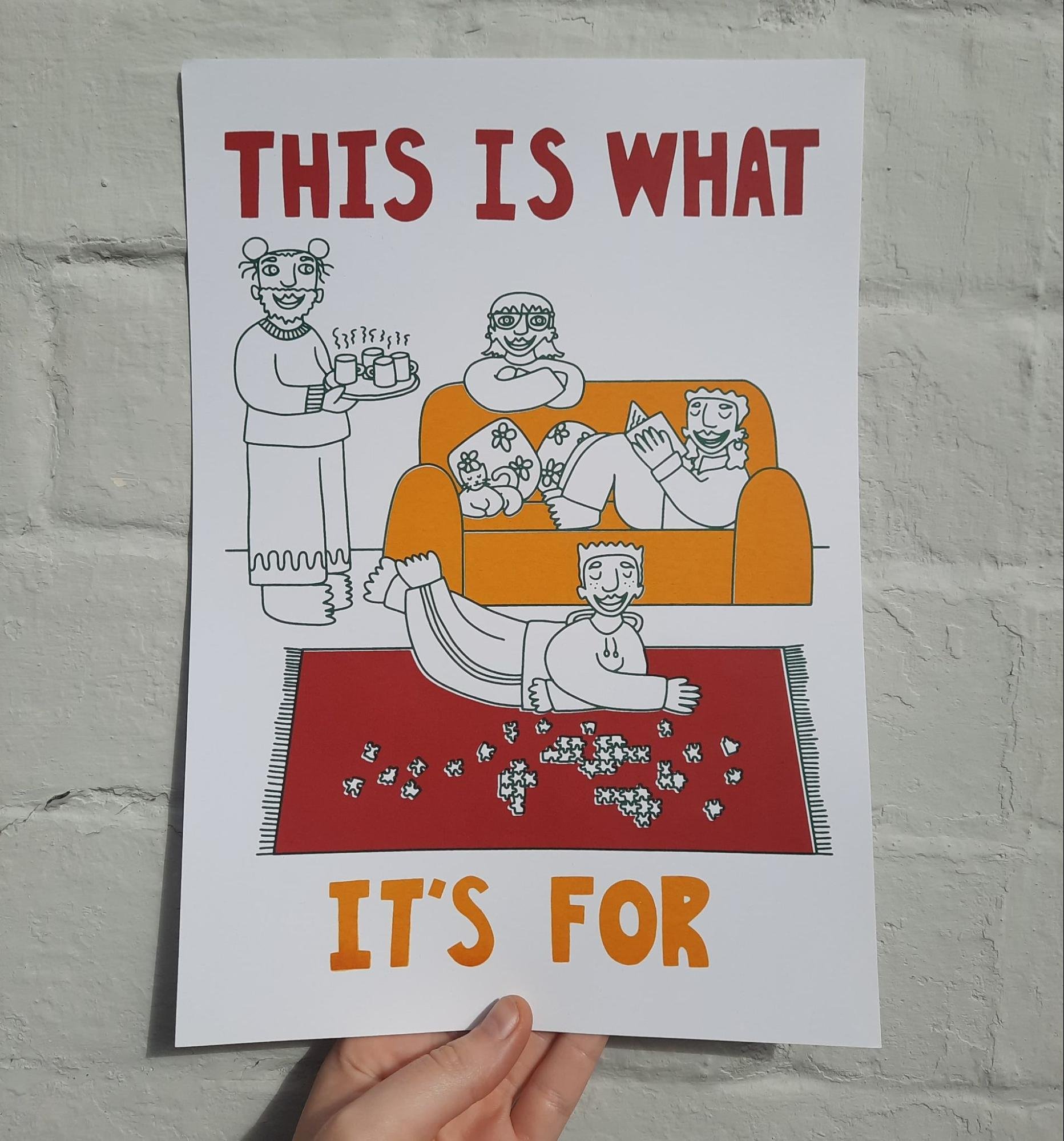
‘This is what it’s for’ print
I love making illustrations about everyday, cosy moments of togetherness between people. I was inspired to make this print by a song called Mullaghmore, which my partner’s sister released as part of a new album. I really enjoyed working on this print, and was especially pleased with how the colours and overall composition came out. It’s a 3 colour print which gave me a bit of a challenge when it came to registration, and while it doesn’t line up perfectly, I am actually very happy with the wonkiness of it.
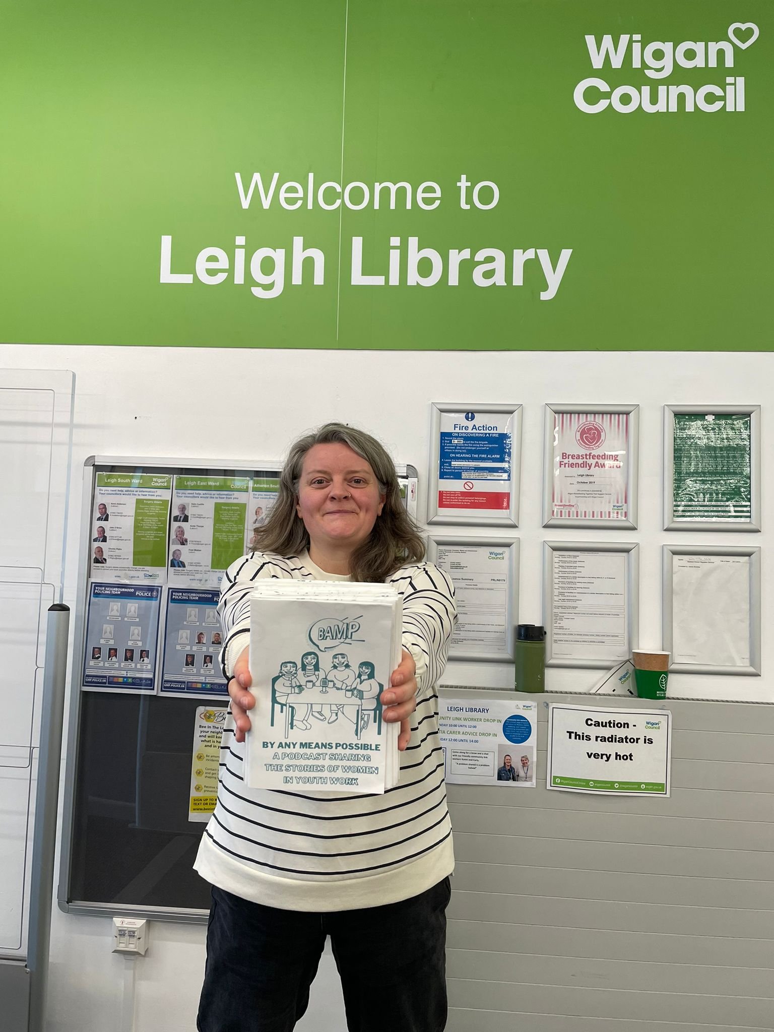
‘By Any Means Possible’ Podcast zine
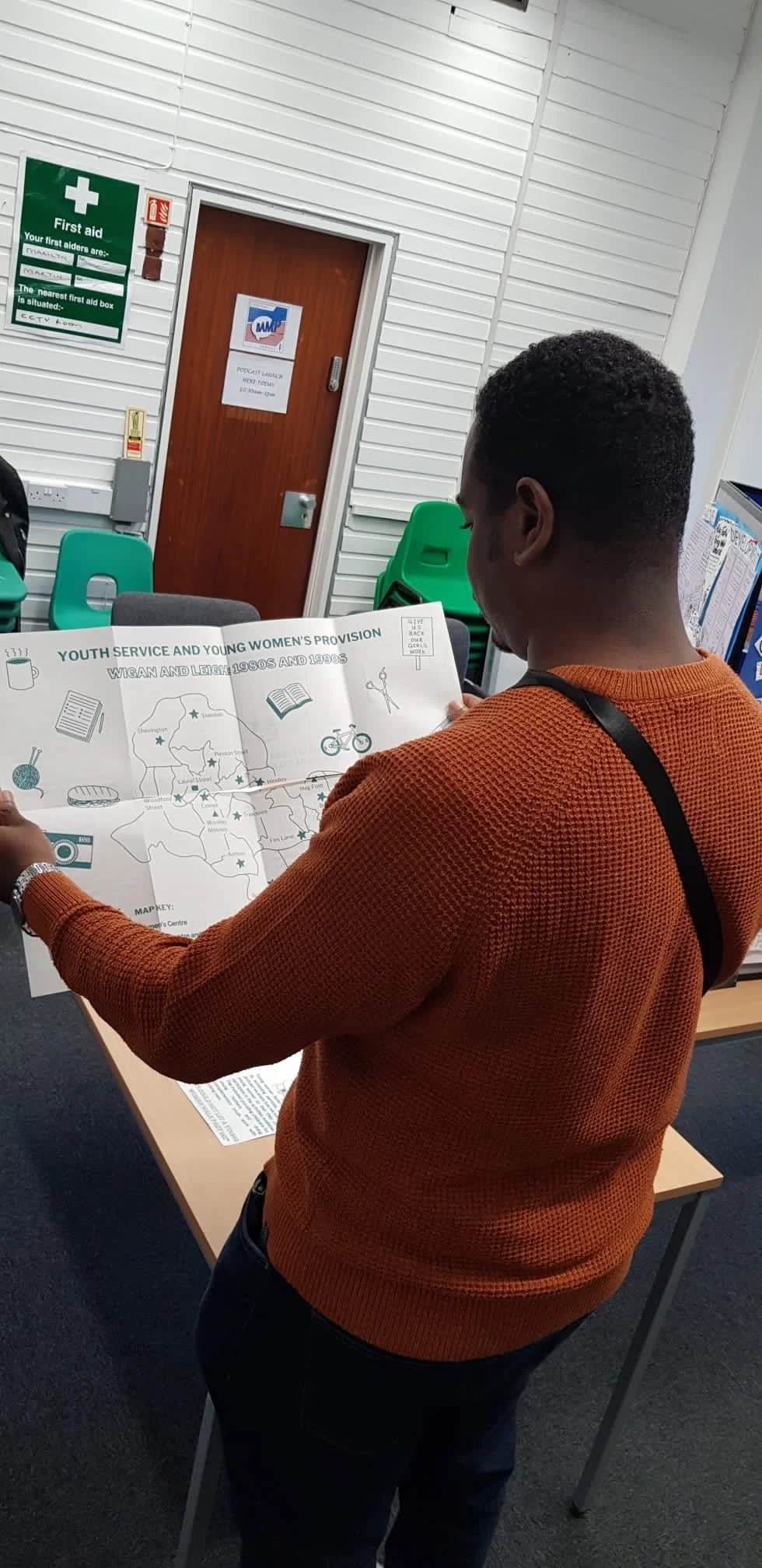
I was employed to make some illustrations for a podcast project sharing the stories of working class women who’d been youth workers in Wigan during the 70s and 80s. They were planning a podcast launch event and asked if I could make some resources and promotional materials. After listening to the podcast I offered to make a zine, and as so much of the women’s stories focused on things with their hands and sharing skills, I offered to screen print it by hand rather than send the designs off to a commercial printer as they first suggested.
I designed the zine layout across an A2 size card with the plan of folding and cutting it down after printing. I also included a map of Wigan and all of the youth centres the women reference during the podcast. This appeared on the other side of the sheet from the zine, so that when folded out it would be an A2 poster. I planned for the print to be one colour, the colour of the podcast logo.
This was definitely the most difficult printing project I did independently during this period. A2 is a large size to print by hand, which is what I had decided to do rather than use the mechanical arm (why???). I decided to do it this way because I had managed to do a run of A2 prints by hand before. However when I’d done it previously I’d only done a run of 10 prints – this time I needed to make 80, and they were double sided… About 10 prints in I started to see blemishes appearing in the print, bits bleeding or not coming through cleanly. Because the job had a very quick turnaround, I didn’t feel like I had time to rethink my plan. Luckily my partner was working nearby so I had to get them to come and help me. We ended up printing the whole run together, two of us on the same squeegee, one on each side. In hindsight I can see lots of different ways I could’ve done this differently and better, and next time I will definitely learn from this. But at the same time I’m just relieved we got it done!
End of mentorship project: November 2023 - December 2023
For the end of mentorship project, I decided to make a small selection of prints for Transgiving, a project I run with my partner sending care packages trans people in need over winter. The packages are usually full of art prints and other gifts made by other trans people – like hats, jewellery, bags, zines, badges and stickers. We sent 300 parcels out this year. I usually try to make a few things to go in the parcels, and doing the mentorship at the same time as organising the parcels felt like the perfect opportunity to make some arty gifts I felt really happy with.
I wanted to use a variety of techniques to show at least some of the things I’d learned over the mentorship. I decided to make some bookmarks, which used screenprint and letterpress. I also made some A4 risoprints. I had planned to do some fabric printing too, printing a design on some mini trans flags. However I decided instead to prioritise making some prints focused on protests demanding a ceasefire in Palestine, as this became something that was (and still is) occupying my mind and life a lot while making the final project. These A3 risoprints were the final thing I made, and rather than including them in Transgiving parcels I have been giving them away to people in exchange for them donating to Medical Aid Palestine.
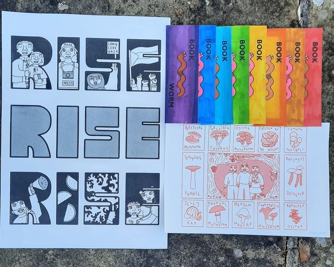
Bookmarks
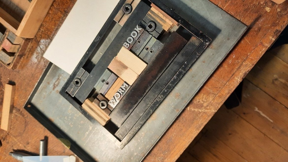
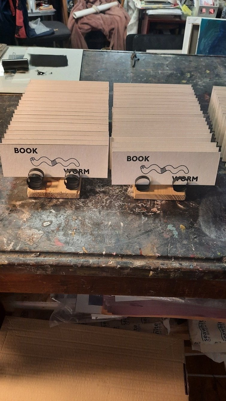
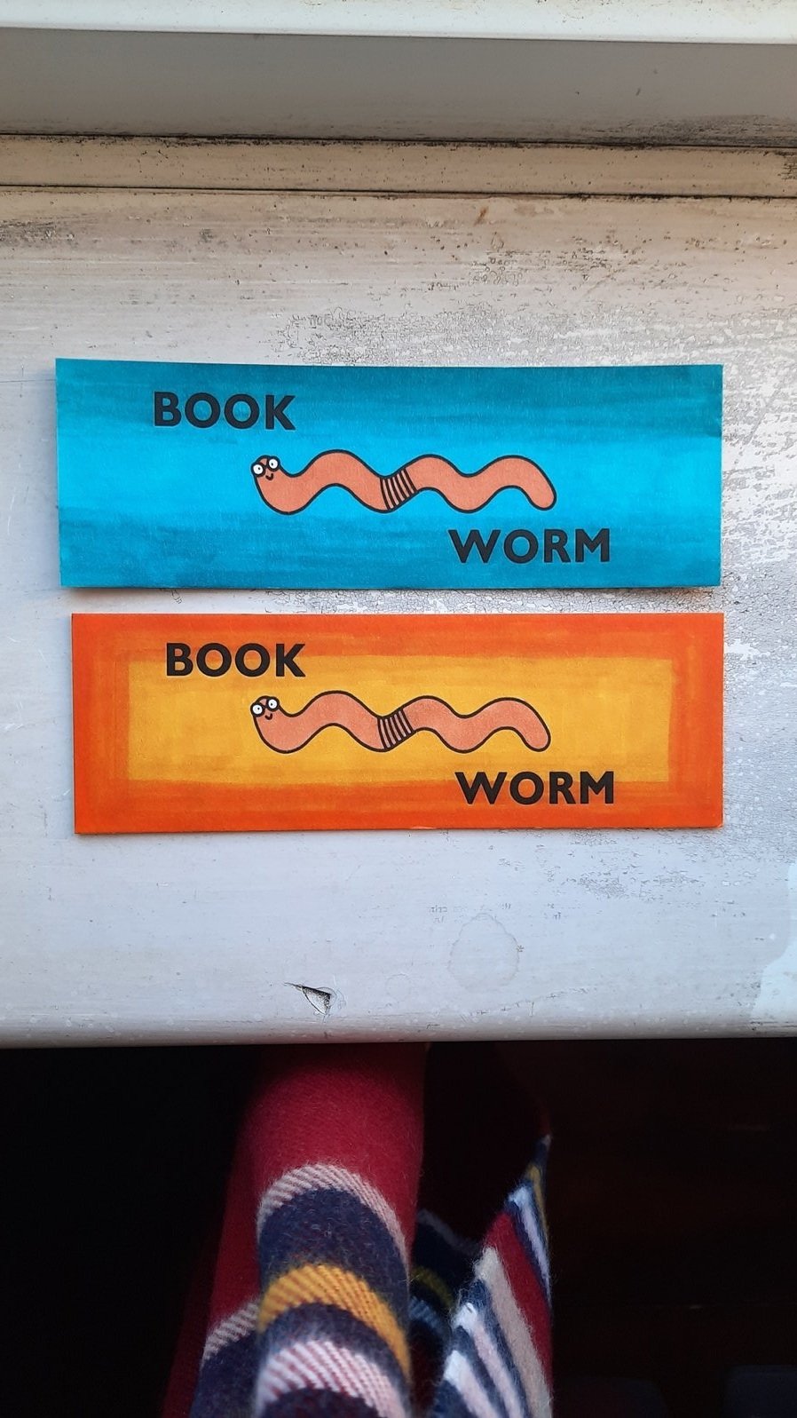
The bookmarks were the most complicated part of the project to make. First Nigel at Amplifer Press taught me about letterpress. Once I’d learned a bit more about the process and that bookmarks were a common thing to make using letterpress, it made sense to make them there. I decided to make a simple design of a nerdy little worm wearing glasses in the middle and the words ‘book’ above them and the word ‘worm’ below them. I decided that only the words would be done using letterpress and that I would screenprint the worm first. I decided that I would just print in black ink on white beermat board (gifted to me by Nige), and potentially colour them in later on using pens or paint.
Printing the letters at Nigel’s was super fun. He is right that the way the paper changes shape with letter press, print digging into the paper, is so cool and adds a whole new element. He showed me how to choose text, lock it into the press, register everything right, and apply ink ready for printing. Printing the 200 bookmarks was very quick and easy considering it was all quite new to me. It felt really satisfying seeing them all finished too. In the end I decided to keep some of the bookmarks in plain black and white, and coloured others using water colour pens. It was really fun to use so many different mediums to make these little bookmarks, and to know all the different elements that went into them. I hadn’t combined different mediums before this, and it has definitely inspired me to think of different ways of doing this more in the future.
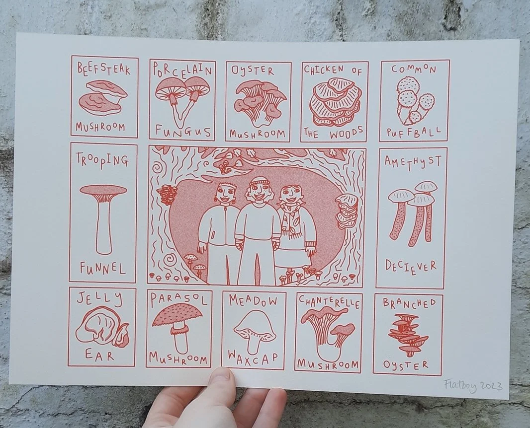
Mushroom risoprints
I also made 300 risoprints of this mushroom illustration for the Transgiving parcels. I actually originally designed it for the Printhaus calendar, but so many people in the registration form for the parcels mentioned loving mushrooms (we ask them if there are particular things they like so we can personalise the parcels), so it felt perfect to reuse the design for this.
I had only used the risograph a couple of times before my end of mentorship project. But even when wrapping up the mentorship, I feel like I have learned so much about riso just from being forced to use it more on my own. I’ve kind of fallen in love with it a bit. I was a bit scared to make these prints, it’s a lot of prints to make and felt like a lot to go wrong, but I actually really enjoyed making them, adapting when the machine did something I was a bit confused by and trying again until I was happy. It was a simple one colour print, which I tried first in green and then decided on red as the final colour. It was really fun and satisfying making these prints, helping me build my confidence with the riso too. It was nice to be able to make a whole 300 relatively easily (compared to if I had screenprinted them), and include one in every Transgiving parcel.
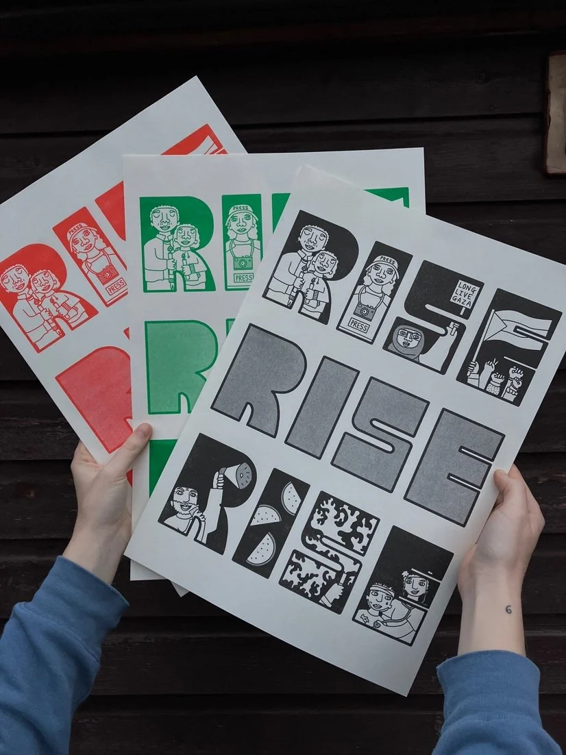
Rise Rise Rise posters
I first thought about screenprinting these, but now that I understood riso a bit more from printing the mushroom illustration I actually thought riso would work perfectly for this print. It was my first time printing A3. The design was a single colour but I printed three different versions in black, red and green (Palestine flag colours). There were a couple of moments doing the red where some weird lines started coming out on the print and I had to work out how to stop that. I used to think of riso as a bit temperamental and too hard for me to understand when things go wrong, so I was proud of myself for making little tweaks like this and feeling confident I could sort the problem. I was so, so happy with how these turned out, and I think they’re favourite thing I’ve made so far.
Wrap up
Looking back on this final project, I am so happy with how the pieces came out and how they align with my values as an artist, the things I want to make and the reasons I want to make them. Comparing my experience making these final prints with the first few projects I wrote about in this journal really shows me how much I’ve learned and how much I’ve grown in confidence. I feel like I now understand how illustrations will look printed in different mediums before I go and choose how to do it. I feel like I can appreciate the different qualities of different sorts of printmaking and what they can bring to different projects. Mostly though, I just love it so much, and my love for printing has grown as I’ve learned more. This has been the best experience and I can’t believe how many prints I have made and how much I’ve learned from different Printhaus members.